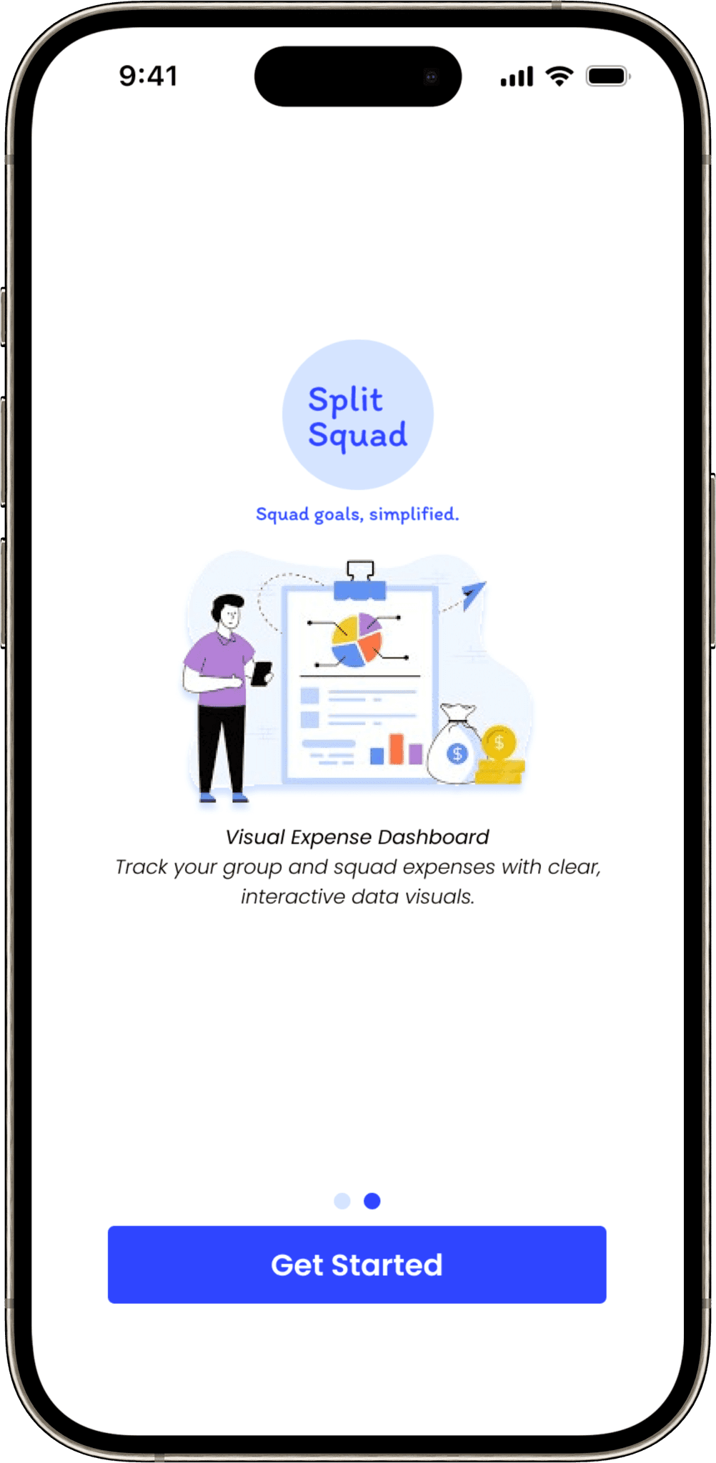
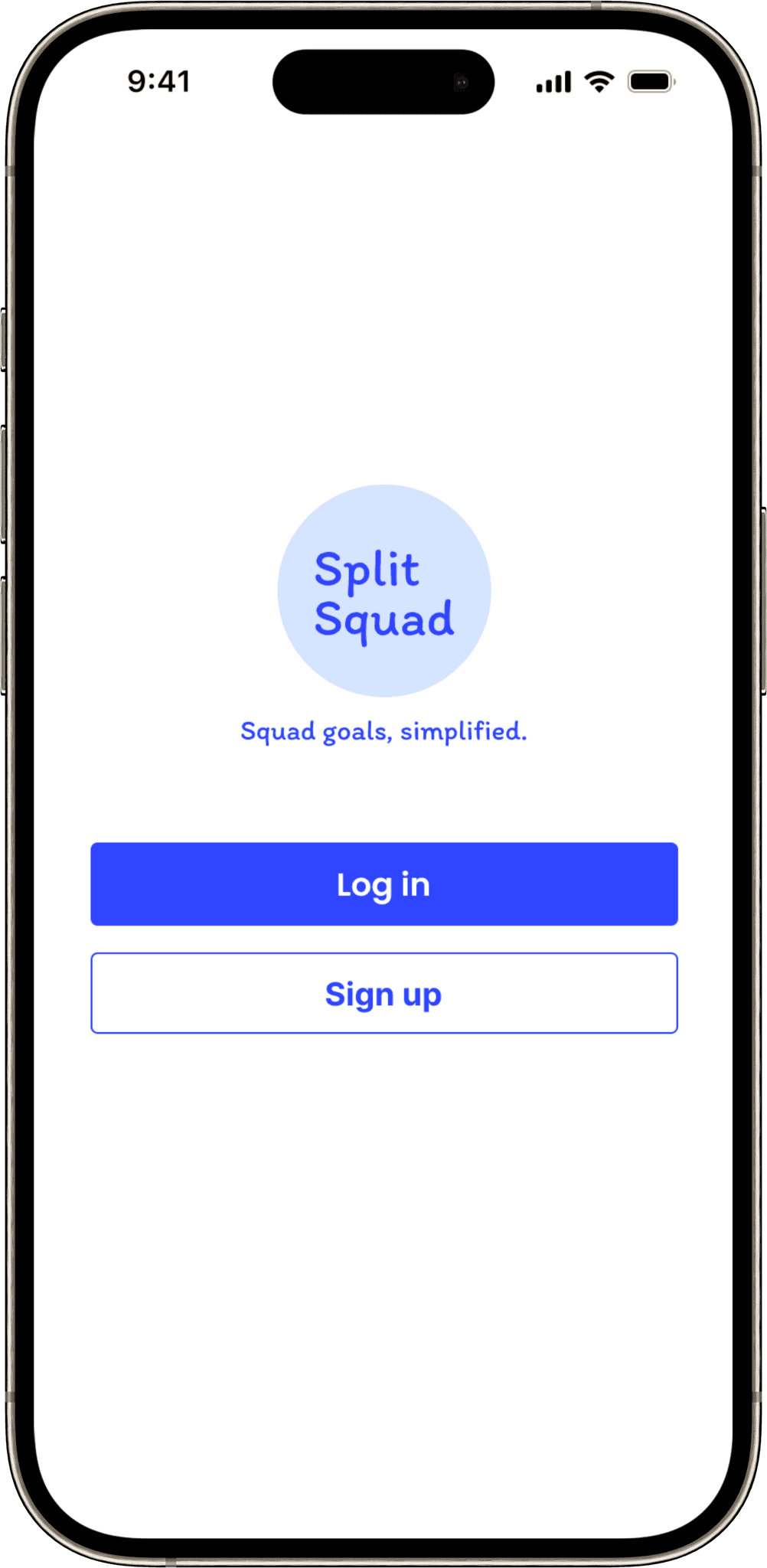
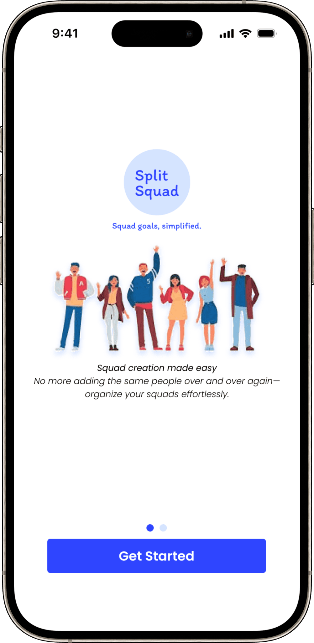
Split Squad
Squad goals simplified
ROLE
UI/UX Design/Product Design
TIMELINE
3 - 4 weeks
TOOLS USED
Figma
Empathize — Understanding the Real-World Problem
🏠 The Origin Story
It all started when I was living in a rented flat with a few of my close friends. Like most shared-living setups, we had to split expenses — rent, groceries, internet, and everything in between.
📒 Our Initial Approach
We first used a notebook to jot things down. It was simple, but hard to track. Later, we moved to WhatsApp where we logged expenses in a group chat — but conversations got buried and important entries were missed.
🧾 Discovering Splitwise
Eventually, we discovered Splitwise, which brought structure and transparency. But as a designer, I couldn’t help but notice issues:
The interface felt outdated
Visual hierarchy was weak
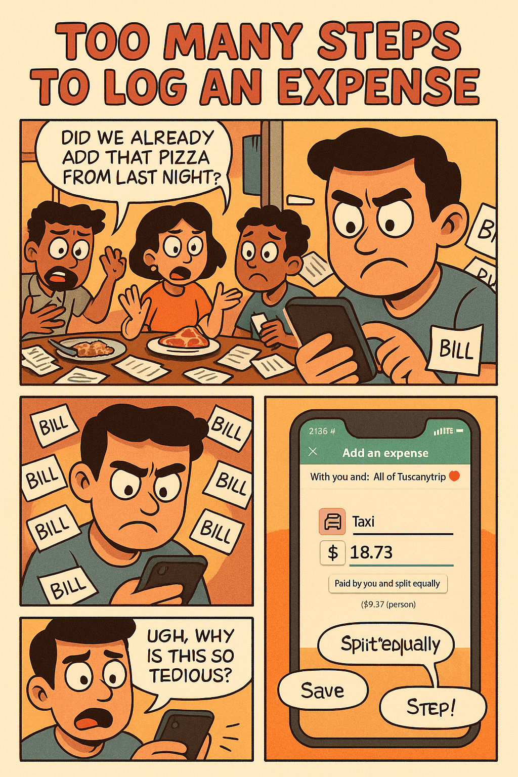
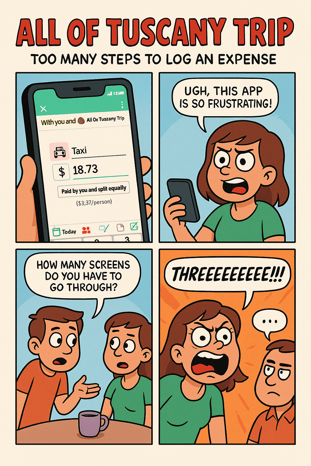
Adding bills was slow and unintuitive
That’s when I began wondering:
What if I could redesign this — not just to look better, but to feel better for today’s users?
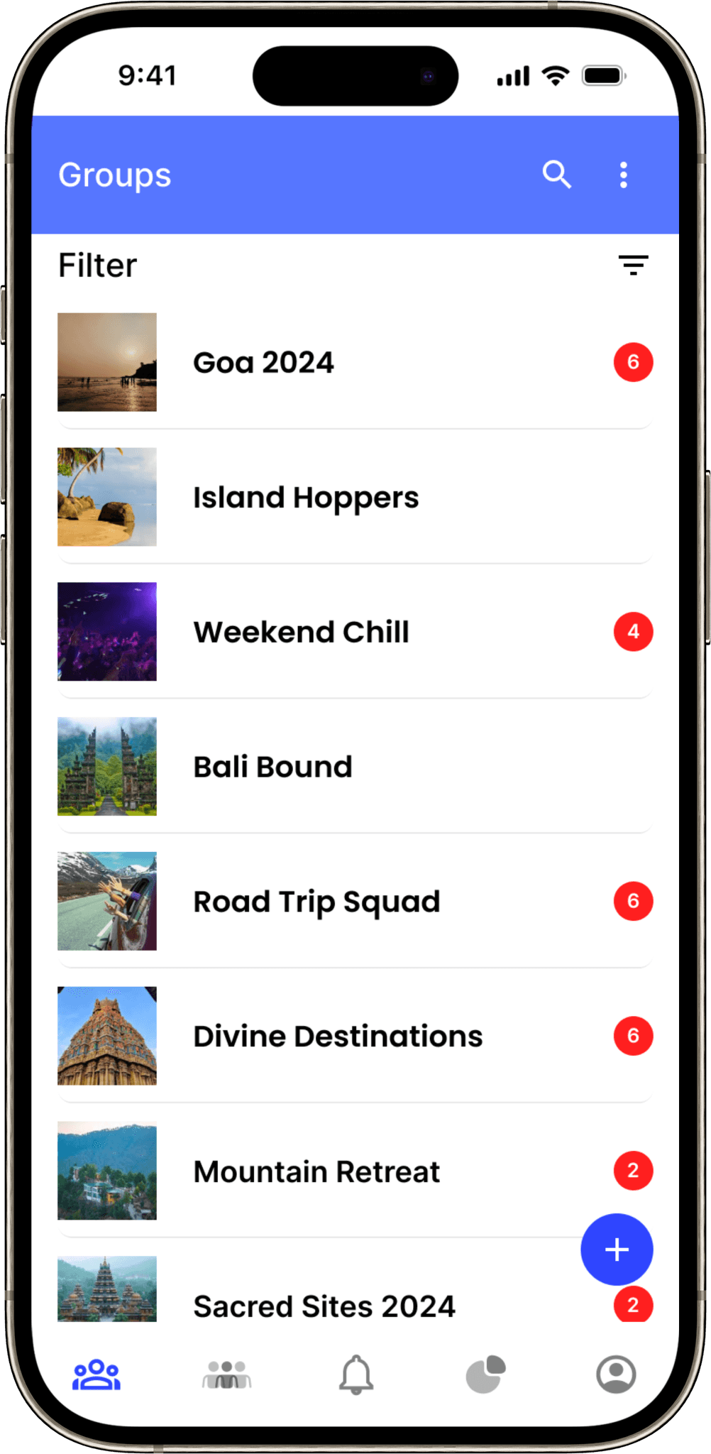
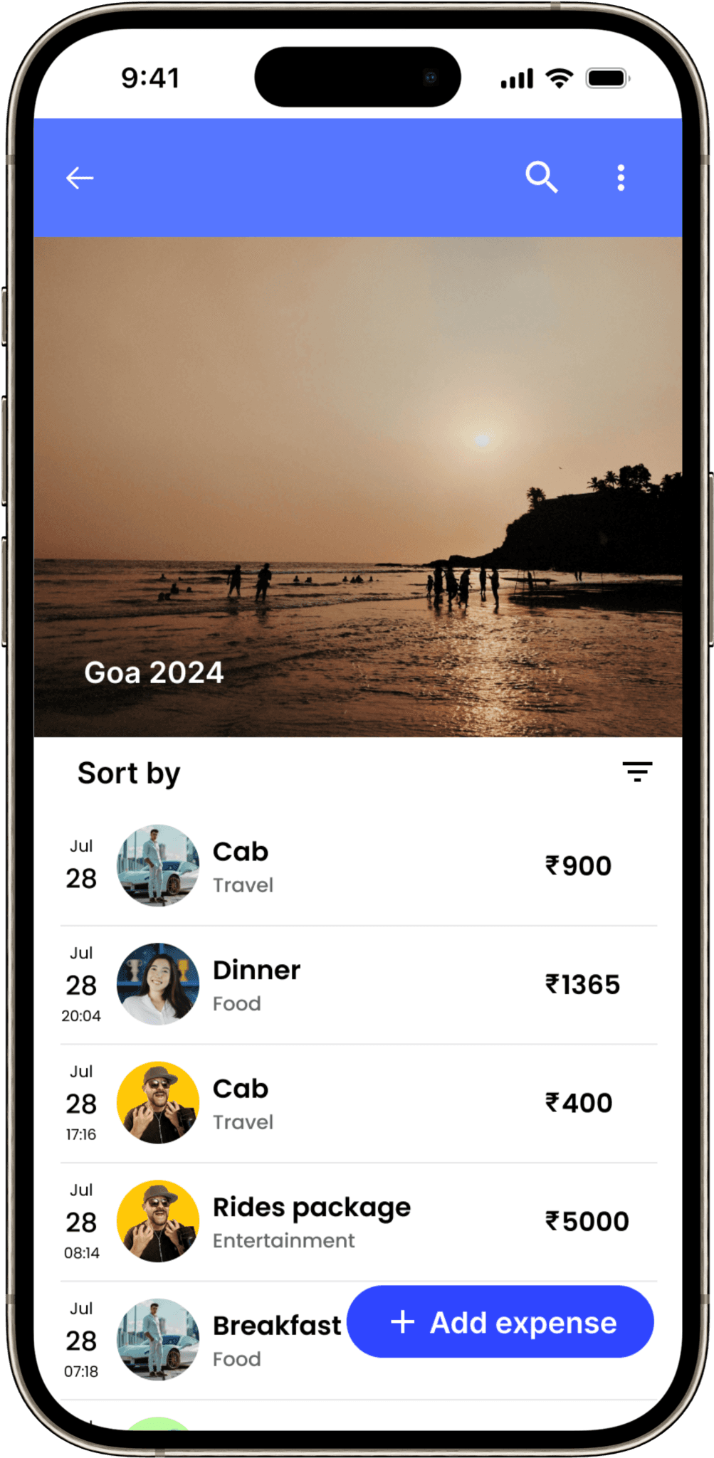
❗ Problem Statement
Despite being a widely-used tool, Splitwise lacks a modern and intuitive user experience. It involves too many steps to log an expense, its interface feels dated, and managing groups (especially for casual outings) feels repetitive and frustrating.
Users need a solution that is:
Visually modern
Quick and frictionless
Adaptive to casual and frequent use cases
Less mentally demanding
Listening to real users
📲 First Stop: App Stores
I started where a lot of users leave their rawest thoughts — the App Store and Play Store. I sifted through hundreds of reviews, looking not just for ratings, but for patterns in what people were saying. And what I found was telling.
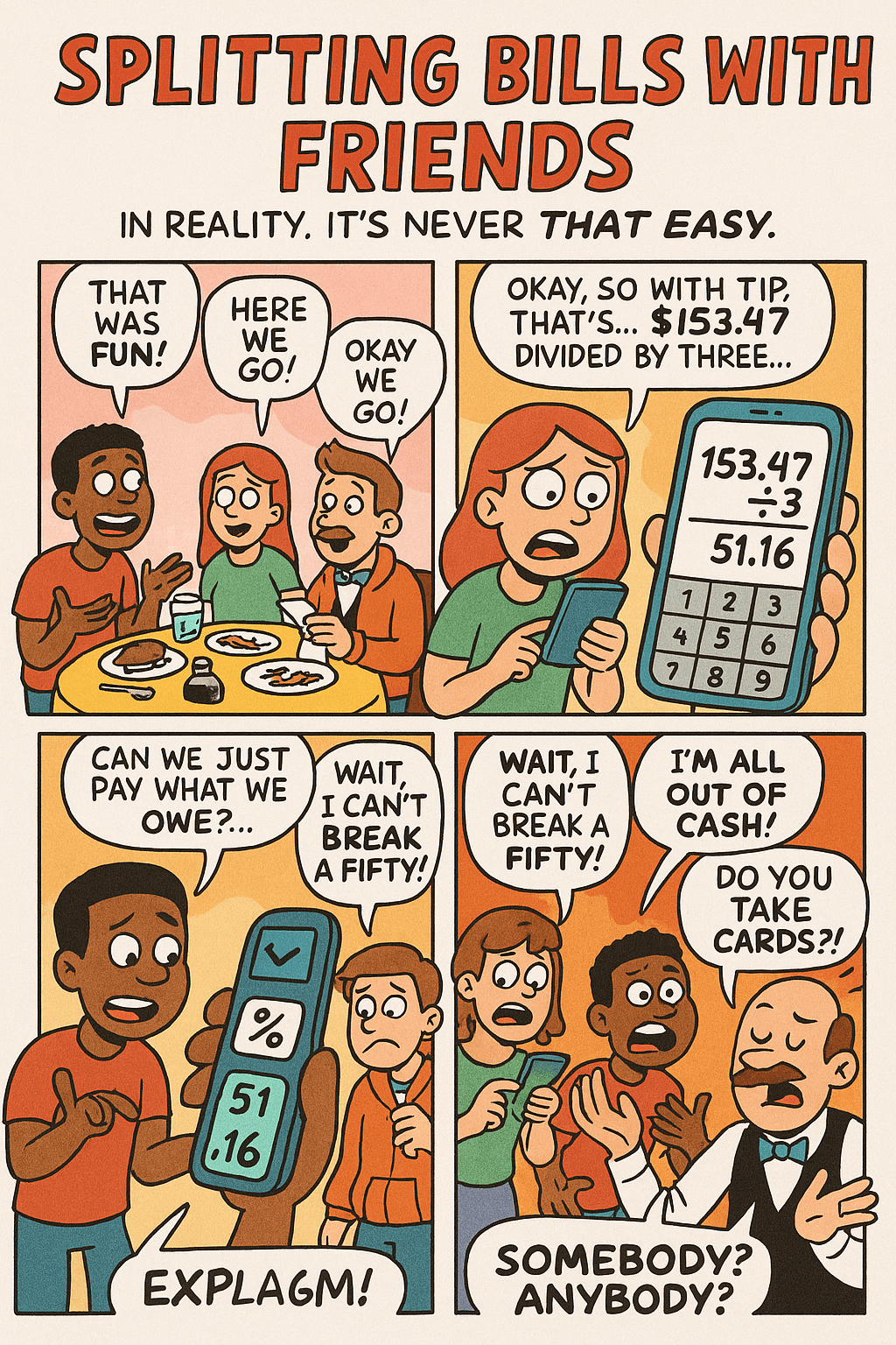
Some were frustrated by how slow and clunky the process of adding expenses felt.
Others pointed out the dated design and confusing interface.
A surprising number of users mentioned how creating and managing groups every time they went out with friends became an annoying chore.
It wasn’t just one or two people — these complaints repeated themselves again and again. It was clear: something was off, and users were asking for more than just new features — they were asking for a rethink.
🧑🤝🧑 From Screens to Real People
Next, I turned to real conversations.
I sat down with friends and flatmates — people I had actually shared expenses with. I spoke to college students who traveled in groups, and even solo travelers who often split bills with new acquaintances. The idea was to get firsthand, real-world experiences from people who’d used these tools often — and had struggled with them just like I had.
Everyone had a version of the same story:
"I don’t want to spend more time logging a bill than I did buying the thing."
"It’s tiring to create a group every weekend just because we went out again."
"Honestly, I just want something that doesn’t feel like a chore to use."
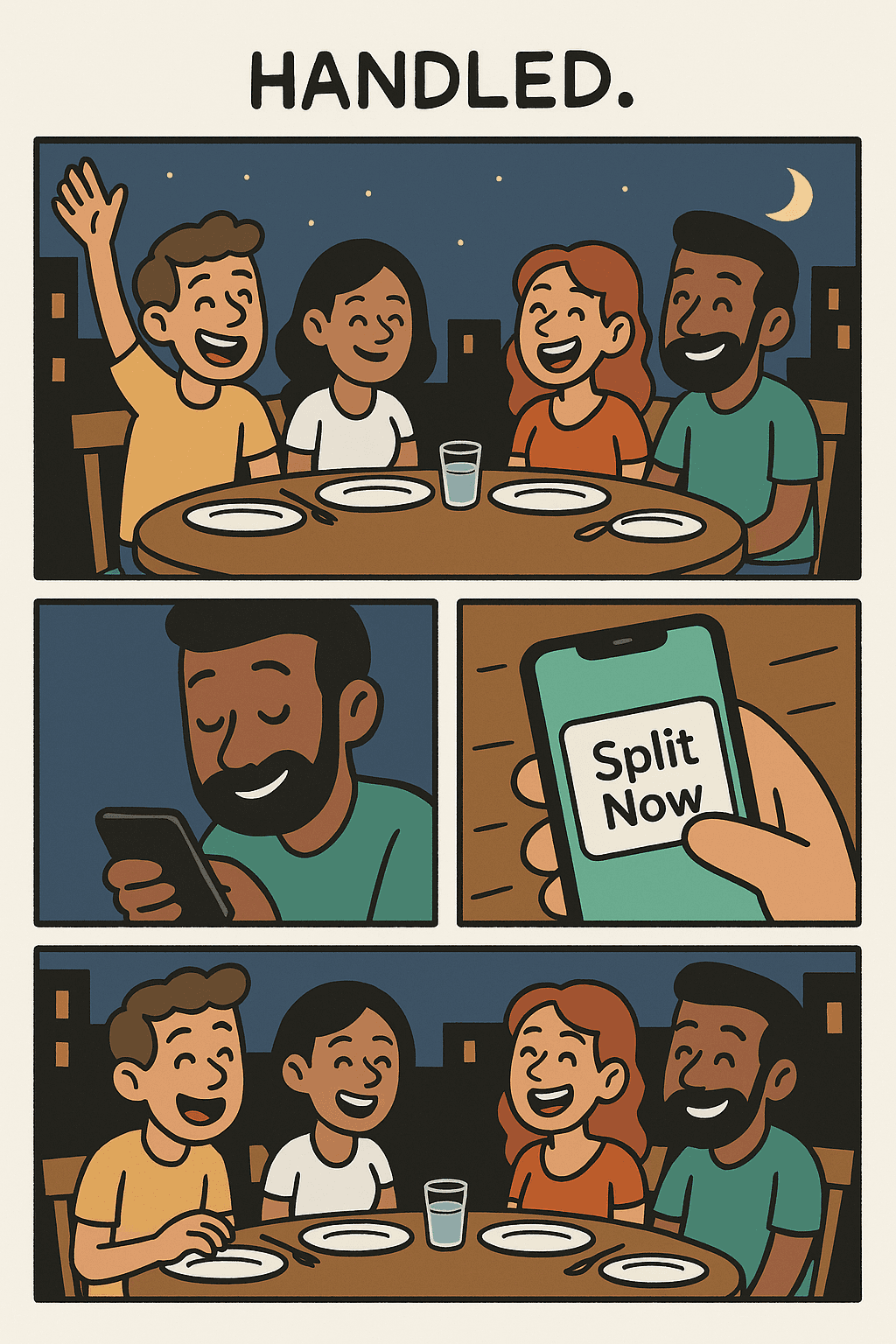
One thing stood out across all these interactions: People weren’t asking for more features — they were asking for less effort.
They craved an app that could keep up with their lifestyle: fast, flexible, clean, and reliable. Something that didn’t just work, but worked in a way that felt invisible — quietly doing its job while people lived their lives.
🧠 Research Synthesis — Making Sense of it All
🔄 What Users Really Wanted
Simplicity: No overthinking. Just tap, add, done.
Speed: A flow that feels like second nature, not a form to fill out.
Modern Aesthetics: Clean spacing, visual hierarchy, and colors that make sense.
Flexibility: The freedom to split costs without always creating formal groups.
Empathy: A design that feels like it understands them.
📌 Personal Insight
I realized I wasn’t designing for “users” in a generic sense. I was designing for…
The friend who always gets stuck calculating the split
The introvert who doesn’t want to chase people to settle up
The planner in the group who just wants things done without drama
They needed an interface that could support real friendships, not complicate them.
Too many steps to add an expense
Streamline with smart defaults & quick actions
Outdated interface
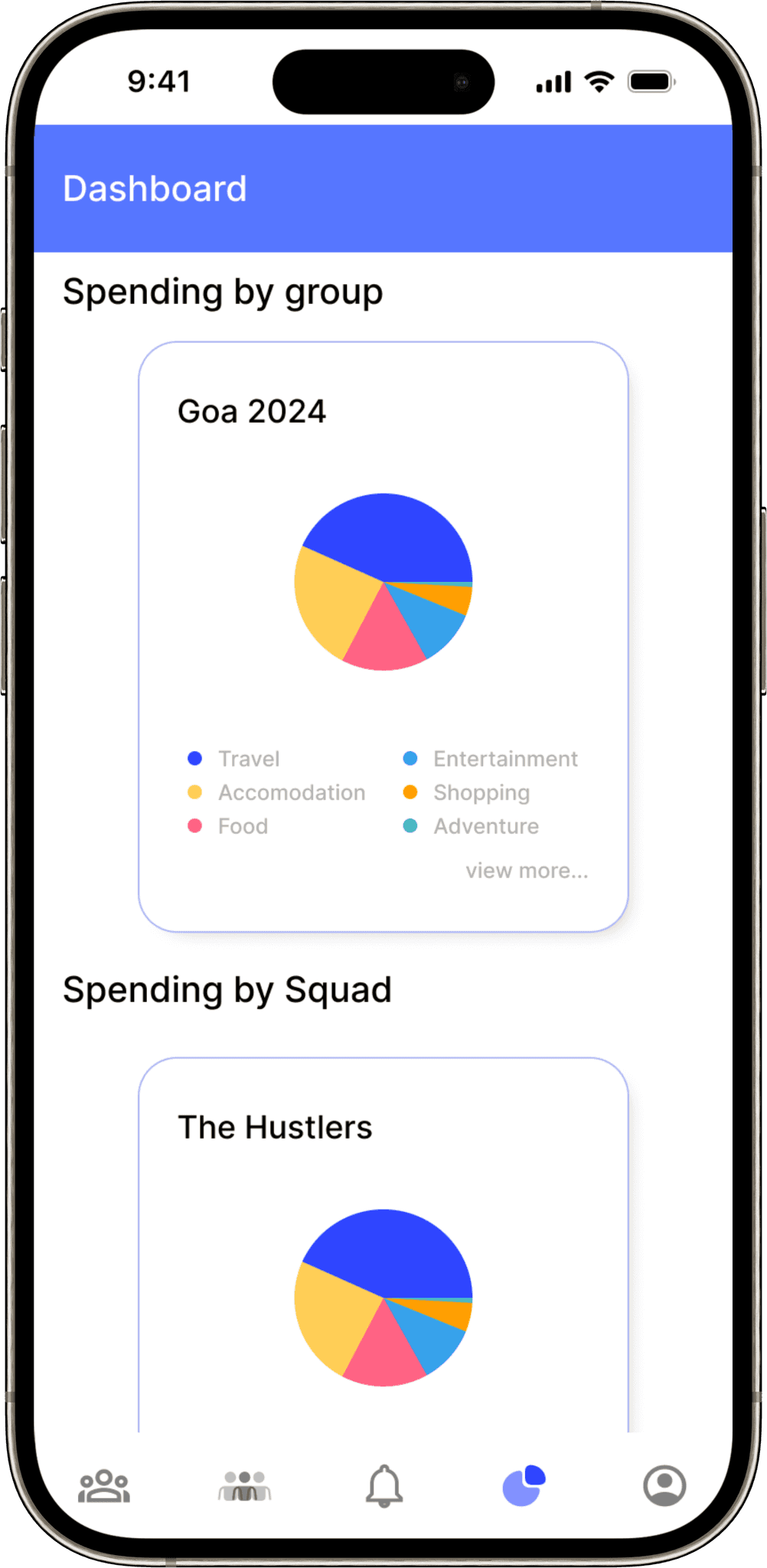
Apply modern UI principles & visual hierarchy
Repetitive group creation
Enable lightweight “quick sessions” or smart groups
Overwhelming layout
Guide with fewer, clearer actions and a calming UI