Made with Love, Care & a good playlist by Rithwik © 2025
Made with Love, Care & a good playlist by Rithwik © 2025
Made with Love, Care & a good playlist by Rithwik © 2025
UI/UX Case Study
UI/UX Case Study
UI/UX Case Study
Capture Scene
Capture Scene
Capture Scene
Relive what moved you
Relive what moved you
Relive what moved you
TIMELINE
TIMELINE
TIMELINE
3 - 4 Weeks
3 - 4 Weeks
3 - 4 Weeks
ROLE
ROLE
ROLE
UI/UX Design, Product Design
UI/UX Design, Product Design
UI/UX Design, Product Design
🎬 It All Started With a Fall — The Amazing Spider-Man 2
🎬 It All Started With a Fall — The Amazing Spider-Man 2
🎬 It All Started With a Fall — The Amazing Spider-Man 2
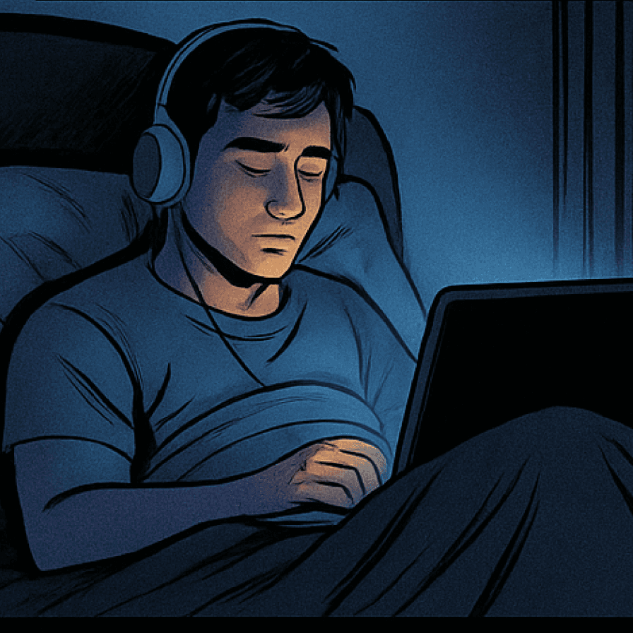
It was a late night. I was curled up, headphones on, screen glowing in the dark, watching The Amazing Spider-Man 2 — a film I’d seen before but never really watched like this.
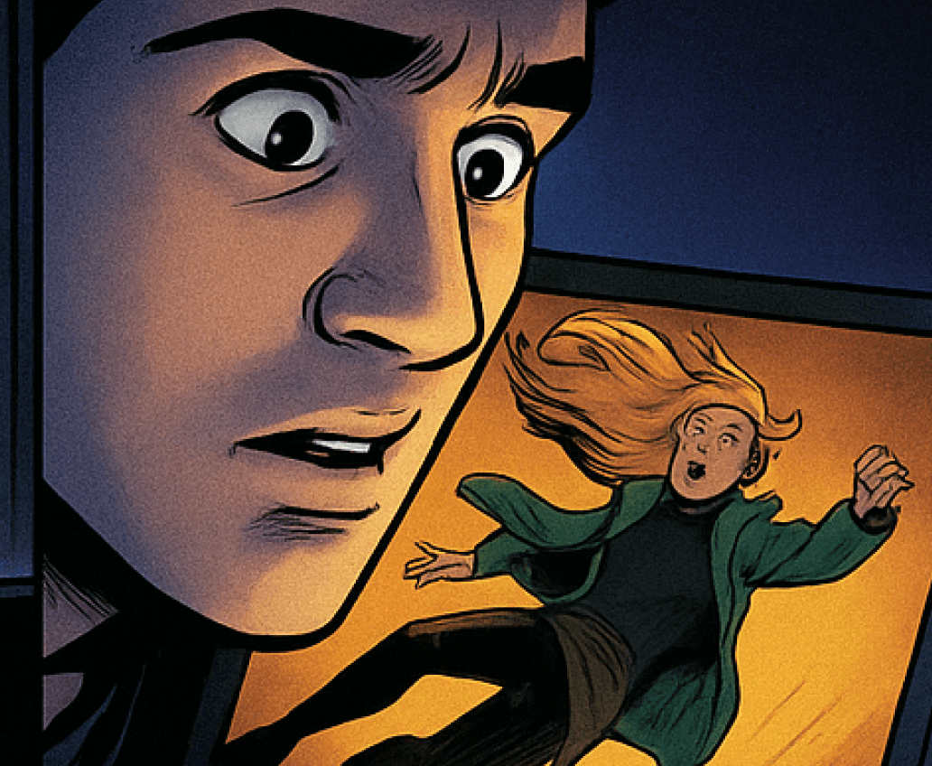
Then came that scene.
Gwen Stacy’s fall.
It was a late night. I was curled up, headphones on, screen glowing in the dark, watching The Amazing Spider-Man 2 — a film I’d seen before but never really watched like this.
Then came that scene.
Gwen Stacy’s fall.
The tension, the silence, the web snapping through the air — and then… the pause. The realization. The heartbreak.
Everything about that moment was perfect — the cinematography, the score, the way time seemed to slow down. It wasn’t just a scene anymore — it became a feeling. One that I wanted to hold onto.
And like anyone who’s ever fallen in love with a movie moment, I wanted to rewatch it. Maybe tomorrow. Maybe next week. Maybe whenever I needed to feel something again.
But when I tried… I couldn’t find it.
I scrubbed through the timeline. Jumped between scenes. Rewatched entire chunks I didn’t care about, just to catch that one fall. I even Googled “what time does Gwen die in Amazing Spider-Man 2?”
And that’s when it hit me
But when I tried… I couldn’t find it.
I scrubbed through the timeline. Jumped between scenes. Rewatched entire chunks I didn’t care about, just to catch that one fall. I even Googled “what time does Gwen die in Amazing Spider-Man 2?”
And that’s when it hit me
“Why isn’t there a simple way to save a scene I love — just like saving a photo or bookmarking a webpage?”
“Why isn’t there a simple way to save a scene I love — just like saving a photo or bookmarking a webpage?”
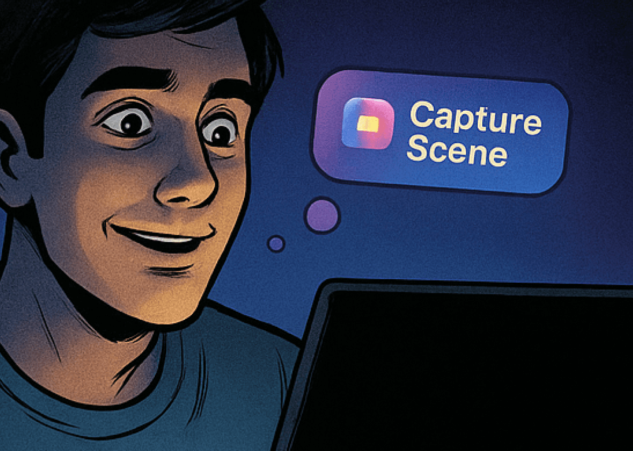
That frustration became the spark for Capture Scene — a feature that gives viewers a simple, intuitive way to save, organize, and revisit the moments that matter most.
Because sometimes, it’s not the movie we love — it’s that one scene.
That frustration became the spark for Capture Scene — a feature that gives viewers a simple, intuitive way to save, organize, and revisit the moments that matter most.
Because sometimes, it’s not the movie we love — it’s that one scene.
🧩 Problem Statement
🧩 Problem Statement
There are moments in movies and series that resonate so deeply with us — they might echo a real-life memory, an emotional fantasy, or just feel too iconic to forget. But revisiting them? It’s a pain.
You either fast-forward blindly, try to scrub through the timeline hoping to land on that moment, or if you’re a bit more disciplined, you might note down the timestamp or episode number. But even then, it’s not intuitive — it’s not built-in. The platforms never made it easy to rewatch just that one scene.
That’s when the problem hit me hard:
What if there is a way to simply capture a scene and revisit it just like we resume an unfinished episode or access downloaded content?
💡 Solution
💡 Solution
The idea is simple but powerful — a “Capture Scene” feature integrated into OTT platforms like Netflix, Prime Video, and Hotstar.
Just like there’s a "Next Episode" or "Subtitles" button, imagine a “Capture” button right in the player.
With a single tap, it bookmarks the last few seconds of what you just watched — say 15 seconds by default — and saves it into a dedicated space called Captured Scenes.
These scenes could later be:
Played independently, like clips.
Categorized or tagged by the user.
Downloaded for offline access.
Easily recognized with a unique icon in the downloads library or a dedicated tab/filter.
It’s the equivalent of taking a mental snapshot of your favorite moment — but seamlessly, without friction.
🧪 UX Research
🧪 UX Research
When I first came up with the idea, I wasn’t entirely sure if I was alone in this. I thought — is this just a me thing? Or do others also get emotionally attached to scenes like I do?
So I asked a few of my close friends — the kind who always have a show recommendation ready.
I casually brought it up, “Have you ever wanted to rewatch a specific scene from a movie or show — but found it hard to get to that exact moment?”
Every single one of them said yes — instantly.
Some said they take screenshots of the timeline. Others try to memorize episode numbers or write the timestamp in their notes app.
That’s when I realized — this wasn’t just my idea. This was a real need.
So I decided to take it further.
I created a Google Form and shared it across my circles — students, working professionals, binge-watchers. I wanted to understand how people watch, save, and revisit content.
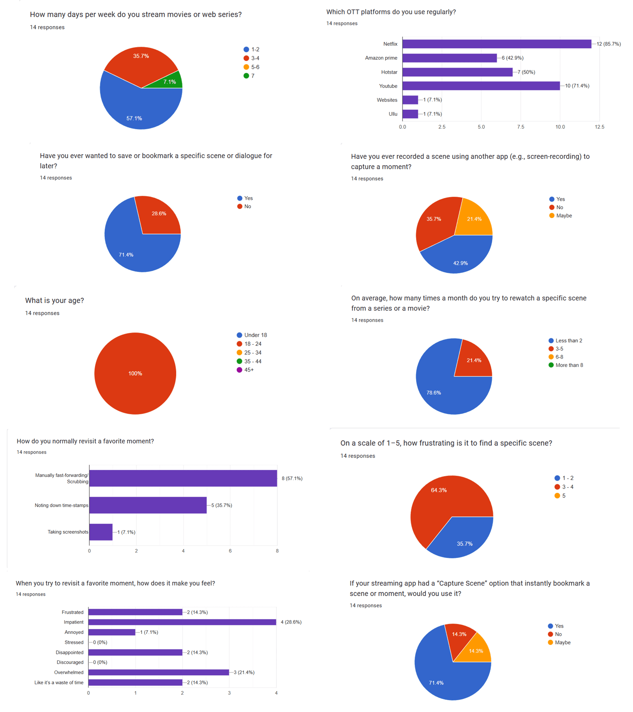
🔍 What I Asked
🔍 What I Asked
Here are a few key questions I included:
How many days a week do you watch movies or series?
Do you ever feel like saving or bookmarking a particular scene?
Have you ever screen recorded or written down timestamps to revisit it?
How frustrating is it to search for a favorite moment again?
Would you use a feature that instantly captures the last 15 seconds of a scene?
User Persona
User Persona

Arjun
College Student
Bio
Arjun is a 21yr old college student pursuing media studies. He lives in a shared flat and spends his evenings streaming movies and web series. Emotional and expressive, Arjun often gets deeply attached to certain scenes that reflect his own experiences
Lifestyle
• Streams on mobile(Netflix, Hotstar).
• Listens to soundtracks from emotional movies.
Saves movie quotes in his notes app.
Goals
• Rewatch scenes that deeply move him.
• Organize his favorite movie moments.
• Discover new emotional content through scene-sharing.
Frustations
• Scrubbing timelines wastes time.
• Hard to remember scene timestamps.
• Feels disappointed when he can’t find “That one moment” again.
“I often rewatch scenes that reflect my life or emotions. I wish there was an easier way to capture them.”
Bio
Meera is a 23ye old marketing intern who enjoys storytelling and film culture. She’s very active on social media and loves posting relatable dialogues or scenes from her favorite rom-coms and dramas. She often uses quotes as captions or saves them for inspiration.
Lifestyle
• Watches Netflix and YouTube.
• Uses Instagram and Pinterest for sharing visual content
• Keeps a note of time stamps of favorite scenes
Goals
• Easily save moments.
• Organize scene references by mood or type.
Frustations
• Time-consuming to revisit moments.
• Can’t always find the right moment quickly.
• Frustrated with lack of scene-level control.
"Sometimes i just want to save that one quote from a movie. It’s annoying to dig through the whole episode again just to find it."

Meera
Marketing Intern
💭 Ideation
💭 Ideation
With the problem clearly validated and user pain points evident, the next step was imagining what a solution could feel like — not just functionally, but emotionally.
I asked myself:
“What would it look like to save a moment from a movie, in the same spirit as saving a photo, or highlighting a line in a book?”
I began sketching out flows — not just UI flows, but emotional ones. How would a user go from feeling something… to wanting to keep it?
And the key insight was this:
Saving a scene shouldn’t feel like a tool — it should feel like a reflex.
That realization pushed me to keep the experience lightweight, non-disruptive, and intuitive. No over-engineering. Just a single action, tied to a strong emotion.
From there, I started exploring:
What the capture interaction would look like
Where it might live in the OTT ecosystem
How users might revisit what they saved later
This conceptual phase grounded the rest of the design exploration — ensuring that every layout, icon, and interaction came back to one thing:
Helping users reconnect with a feeling.
🧩 Integration of Capture Scene into Existing OTT UI
🧩 Integration of Capture Scene into Existing OTT UI
Designing a new feature is one thing — but making sure it feels native, intentional, and non-intrusive inside an existing platform is where the real challenge lies. After deciding on what the “Capture Scene” feature would do, the next big question was:
"Where should it live?"
Should it be just a button? A whole new section? Or maybe a top-bar icon?
These weren’t just design decisions — they were about user habits, information architecture, and the invisible comfort of familiarity.
So I went into exploration mode — trying to visualize how this feature could be introduced in two distinct ways within the layout of an OTT app like JioCinema (Hotstar).
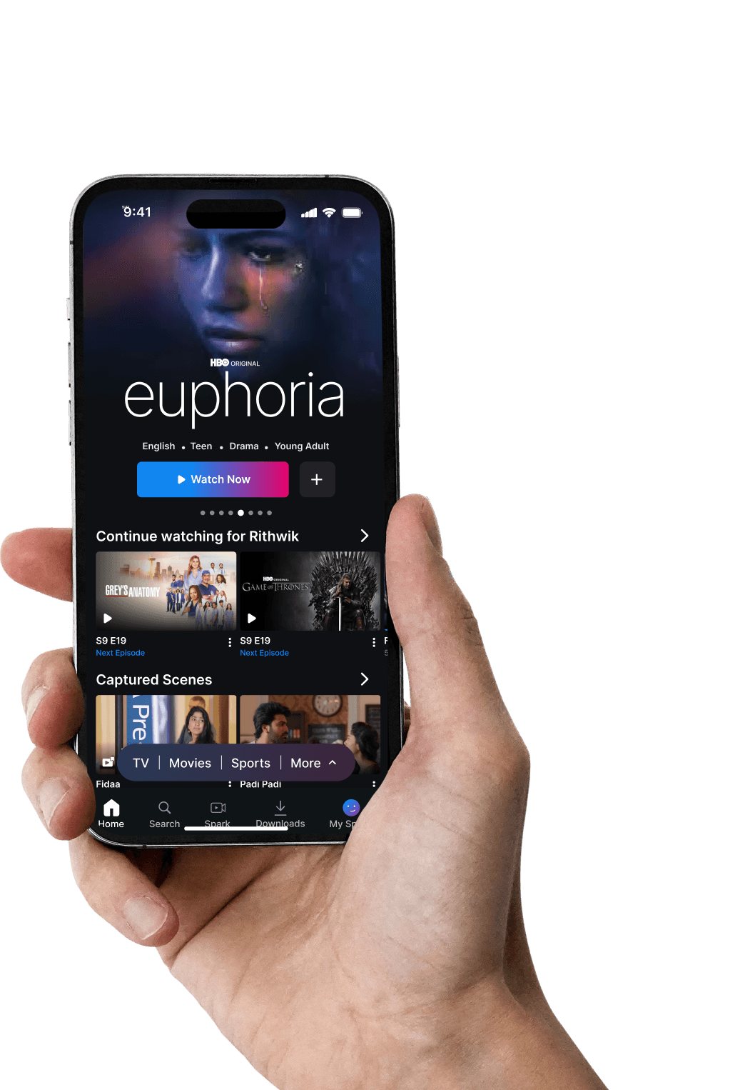
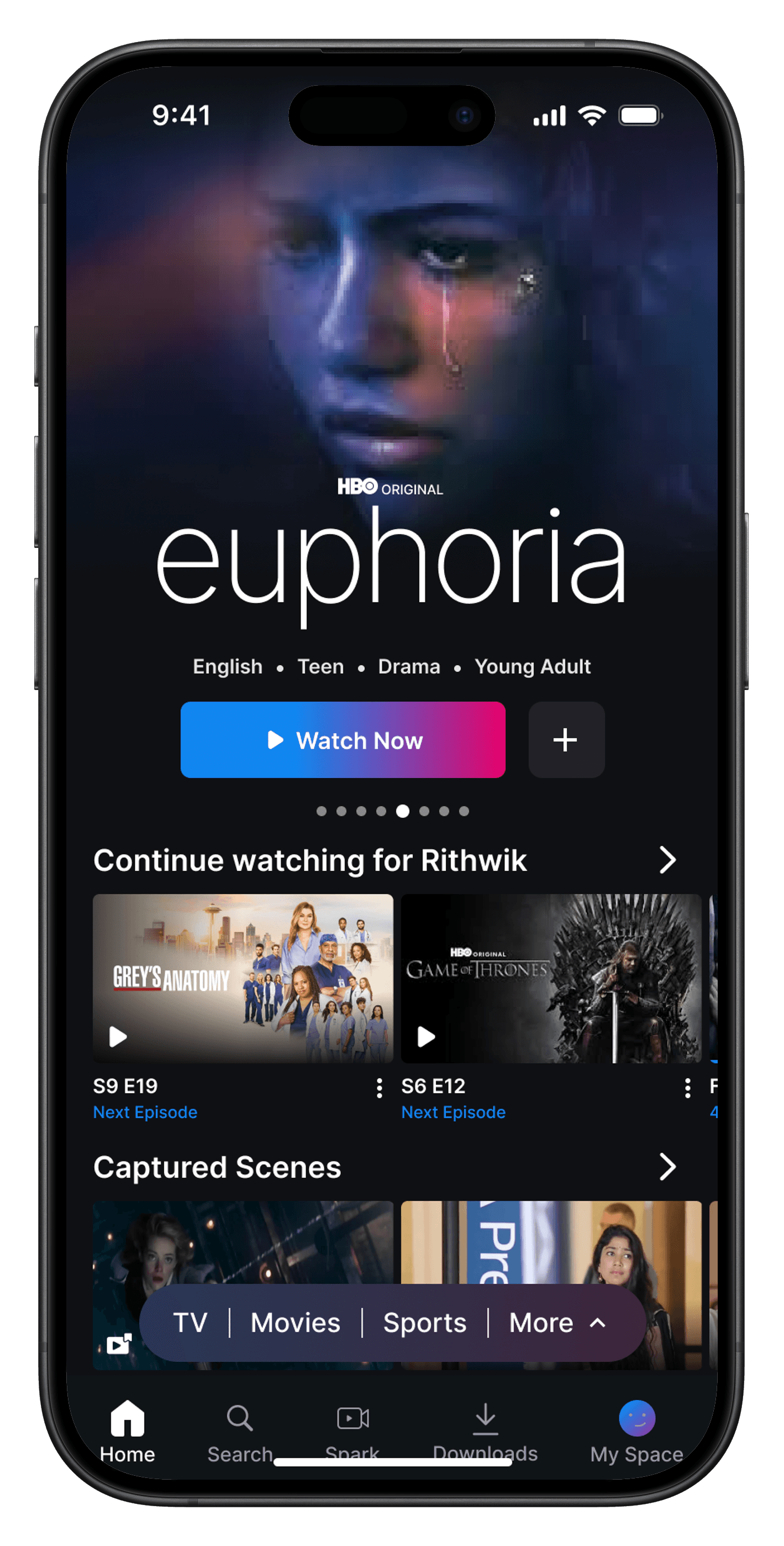
📺 Variation 1 — Seamless Section Integration
📺 Variation 1 — Seamless Section Integration
The first approach was to treat “Captured Scenes” just like a native content shelf.
Imagine you’re scrolling through your homepage, right below your “Continue Watching” section — and there it is:
A brand-new section called “Captured Scenes”, showing thumbnails of your saved moments from various shows and movies.
Each scene card is neatly designed to reflect key attributes:
A Capture Scene icon overlay, so users know this isn’t just another episode or movie.
A thumbnail taken from the actual scene.
The title of the content (e.g., Fidaa), and the duration of the captured moment.
An options icon (⋮) giving access to actions like Edit, Share, or Watch Full Movie.
This felt familiar. Safe. Like something a user could intuitively understand even without instructions.
It doesn't demand change — it blends into the existing architecture.
Just like “Continue Watching,” this new section would represent “Continue Feeling.”
There’s no friction. Just flow.
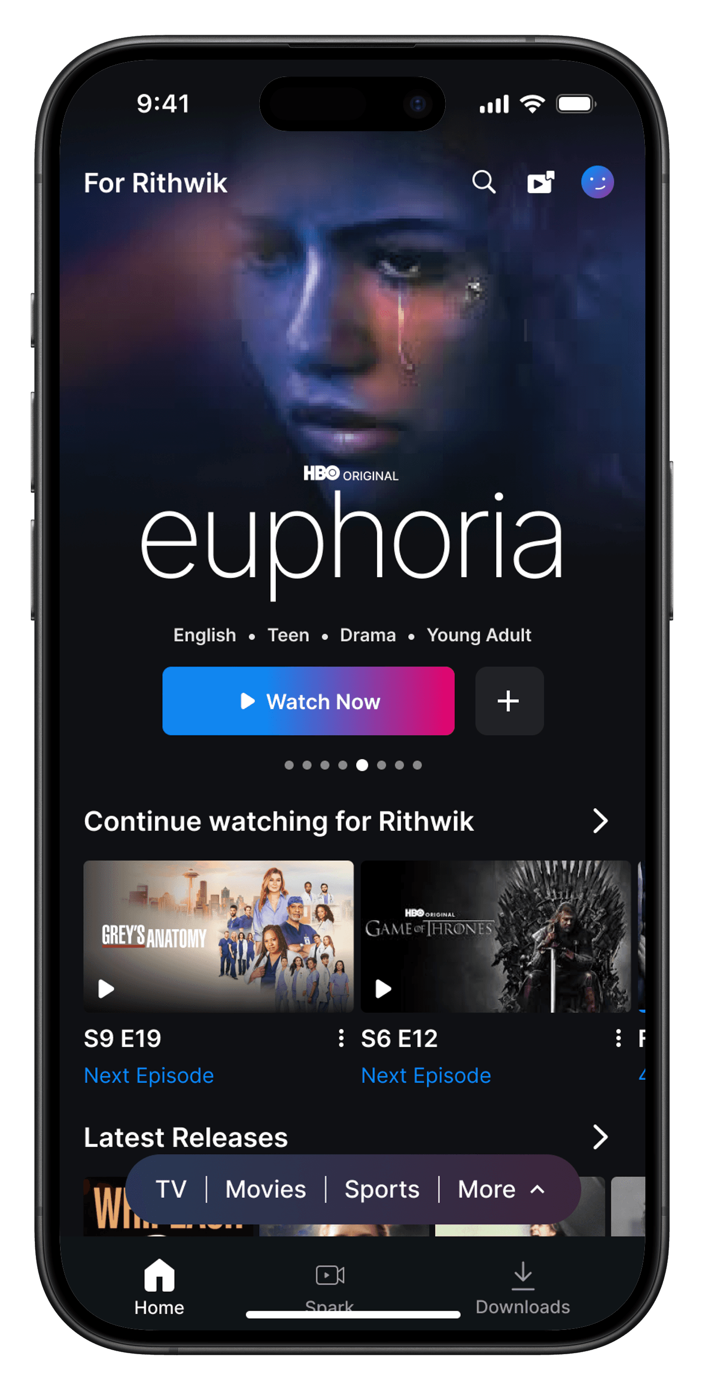
🧭 Variation 2 — Centralized Navigation Placement
🧭 Variation 2 — Centralized Navigation Placement
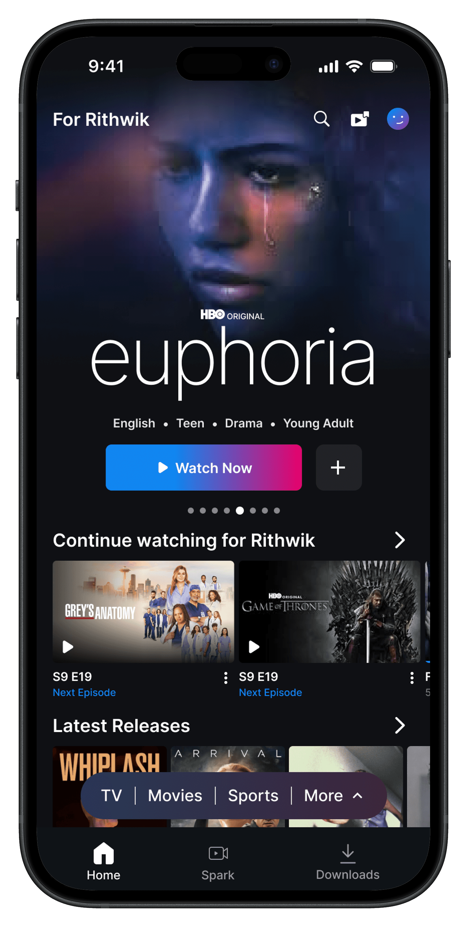
But I didn’t stop there. I asked myself:
“What if this becomes a feature users use a lot? Shouldn’t they have faster access to their captured moments?”
So I explored a different interaction style.
In this variation, I adjusted the home layout slightly:
Moved some lesser-used bottom nav elements (like “My Space”) to the top.
Introduced a new icon (representing Captured Scenes) next to Search and Profile.
The design also included a new touch of personalization — a heading at the top that read “For Rithwik”, replacing the generic carousel label. This subtle change added warmth and intent.
By tapping on the Captured Scenes icon, users could instantly navigate to a dedicated page — something like a personal memory vault, where all the scenes they connected with emotionally were stored.
This variation had its strengths:
Clean, decluttered layout.
Fast access to a feature that could become core for emotionally engaged users.
Encouraged deeper personalization.
However, this route slightly hid the emotional reward. Users might miss the feature unless they were explicitly onboarded or nudged.
While both variations of integrating the feature into the home screen had their own strengths, I ultimately chose to proceed with Variation 1 — Seamless Section Integration for the final design.
Why?
It felt less intrusive, highly discoverable, and most importantly — native to how OTT home screens already function. This variation blends right into the existing scroll behavior, making the new feature feel like it has always been a part of the experience.
With the core placement decided, the next step was figuring out how captured scenes themselves should be presented.
🎥 Designing the Capture Flow — Turning Moments into Memories
🎥 Designing the Capture Flow — Turning Moments into Memories
Capturing a scene shouldn’t feel like a chore. It should feel instant — like freezing an emotion mid-frame. But getting that interaction right meant exploring multiple ways users could initiate and finalize a capture while watching content.
I designed and tested three variations, each with a different philosophy behind how subtle, visible, or interactive this moment should be.
🧪 Variation 1 — The Pop-up Prompt
🧪 Variation 1 — The Pop-up Prompt
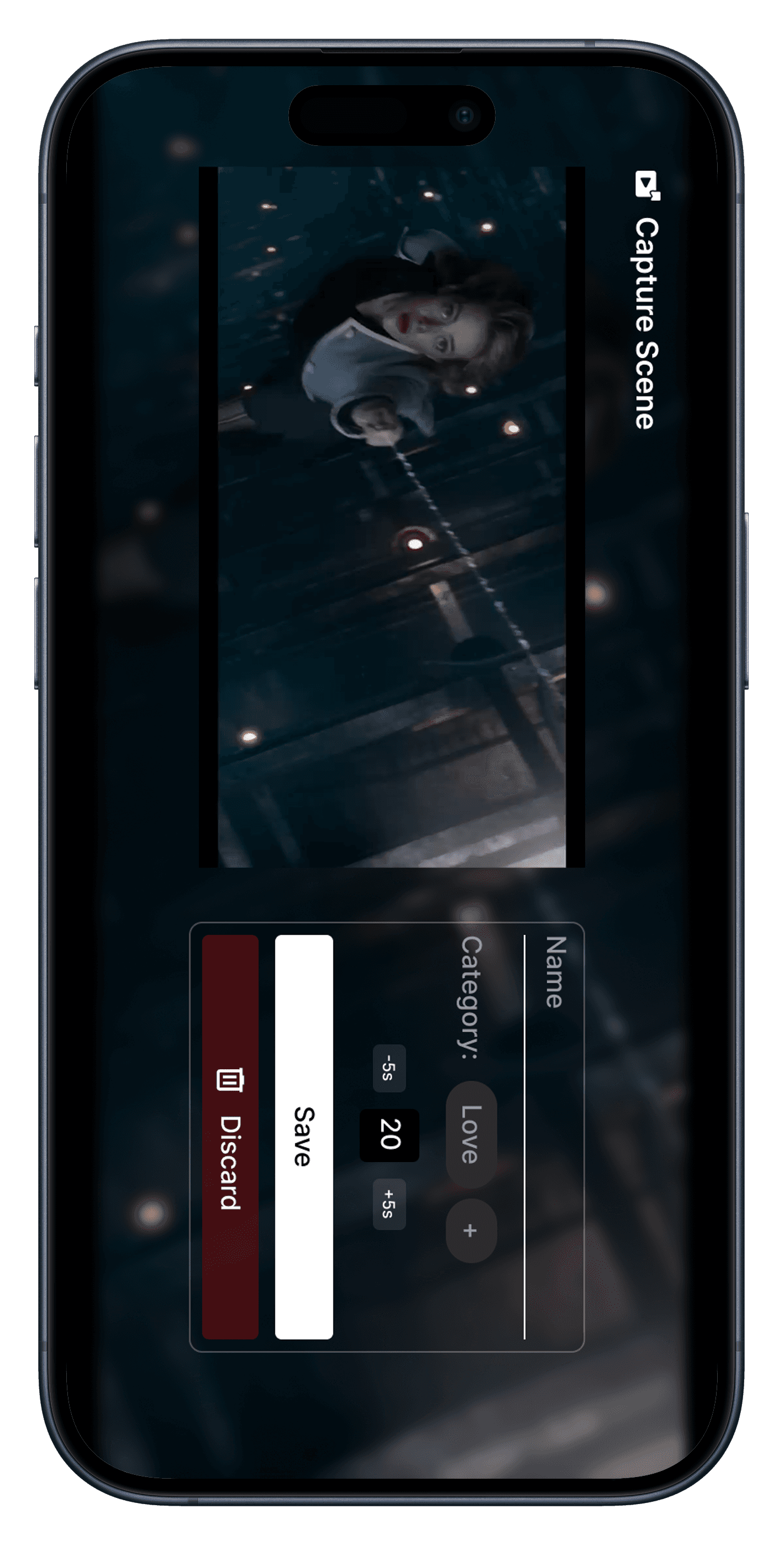
In this version, tapping the “Capture” button triggered a central pop-up overlay. It displayed the duration of the scene, with options to save or discard.
It felt familiar — like setting a timer or cropping a photo. Everything was visible and editable upfront.
But the problem? It interrupted the immersion. The modal took over the screen, pushing users out of the narrative flow just to confirm their choice. It worked, but it felt a little heavy-handed.
🧱 Variation 2 — Sidebar Utility Layout
🧱 Variation 2 — Sidebar Utility Layout
Here, the capture controls were moved to the right side of the screen. The video continued playing in full view, while the UI subtly slid in with duration info and options to adjust or discard.
This version felt functional and efficient. It didn’t interrupt the content, and the controls stayed tucked in the corner. But visually, the layout started to feel cluttered — with movie name, timestamps, and controls all competing for space. It solved the functional problem, but not the emotional clarity.
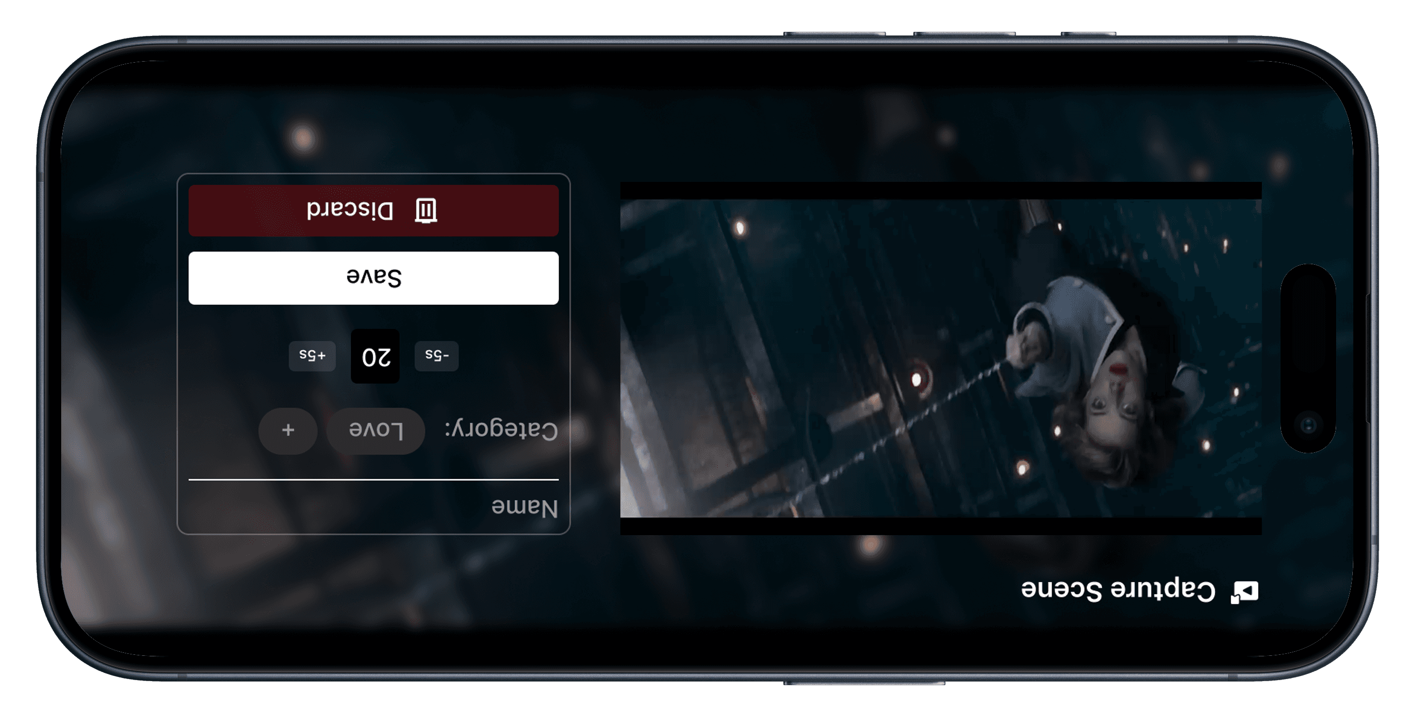
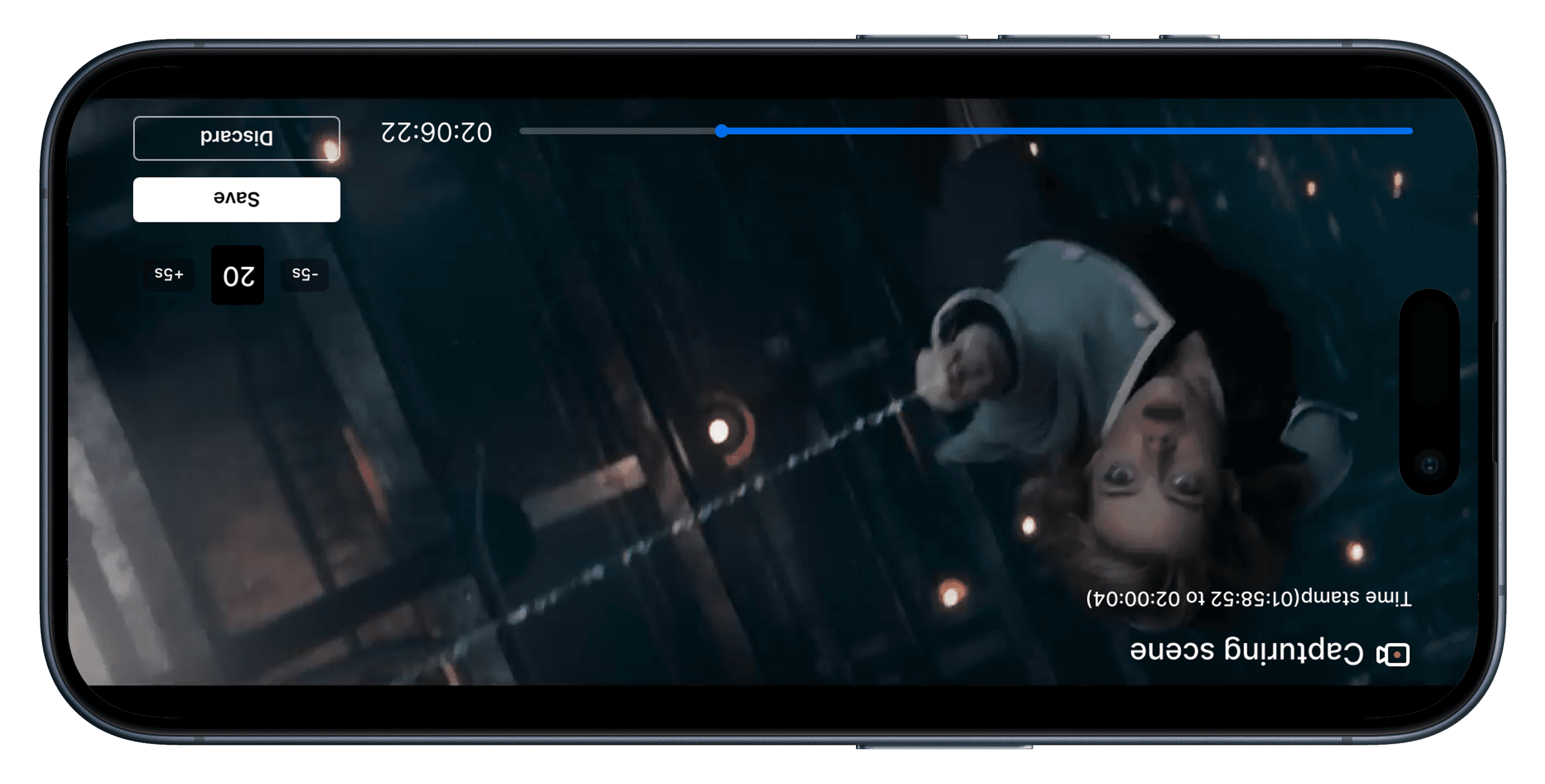
✅ Variation 3 — Clean Inline Controls (Final Pick)
✅ Variation 3 — Clean Inline Controls (Final Pick)
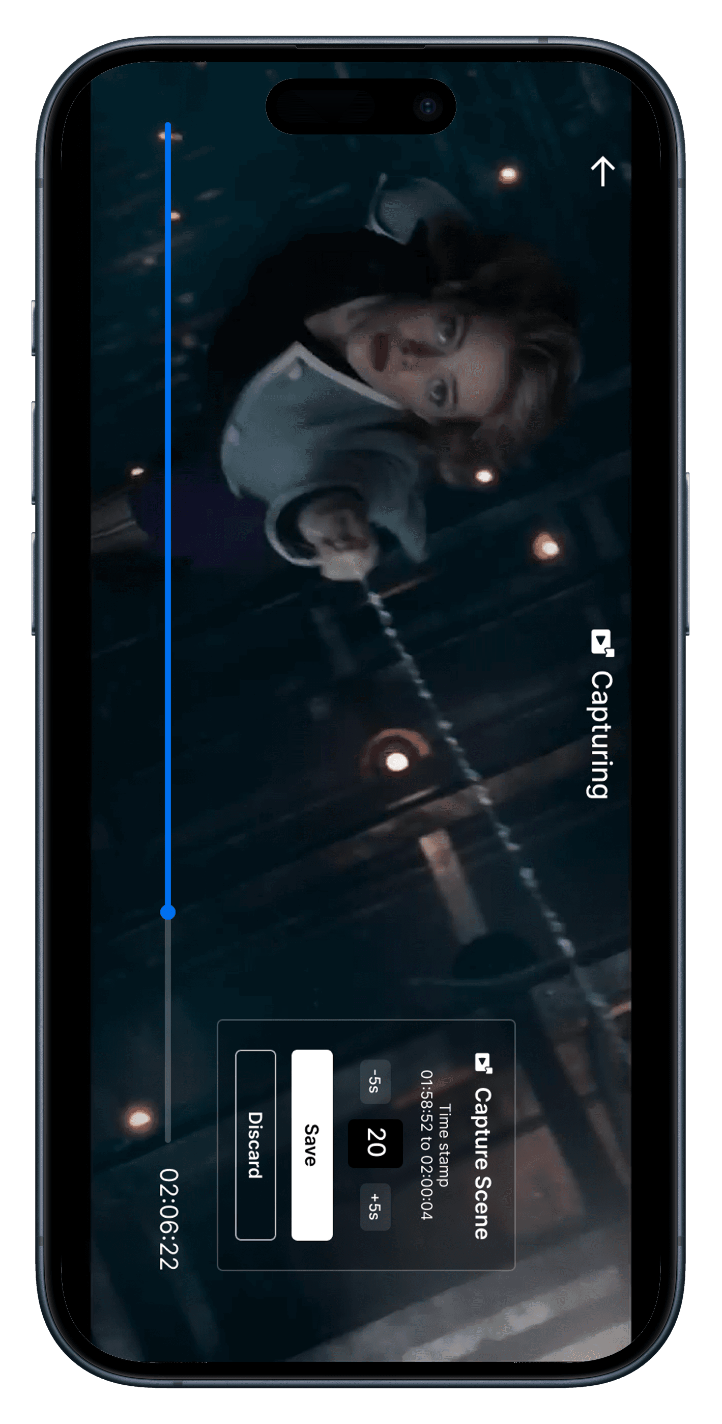
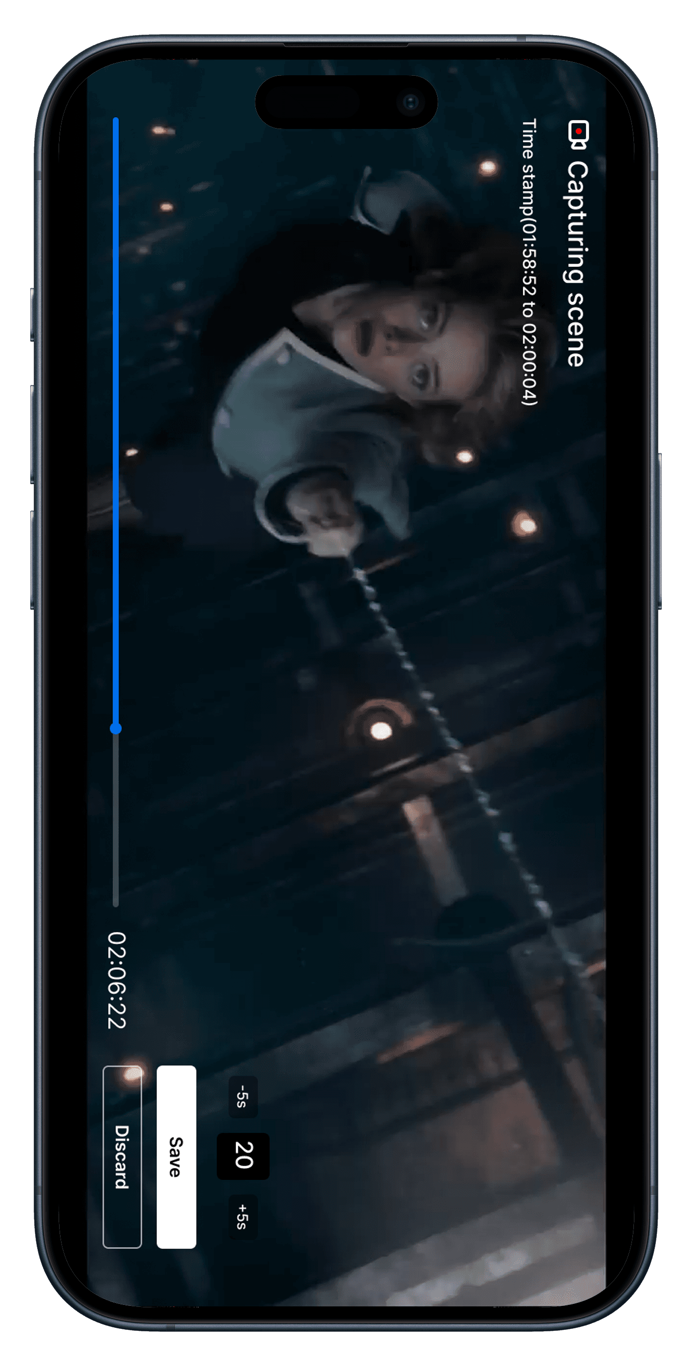
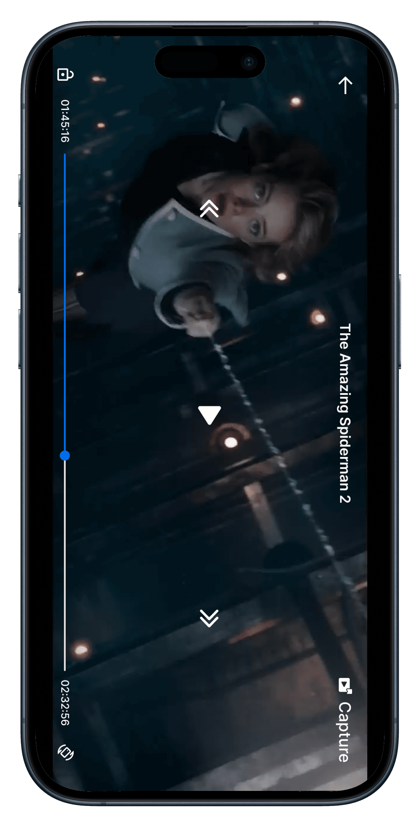
This variation was all about invisible effort. When the user taps “Capture,” the screen gently adapts:
The movie title slides to the top center. A "Capturing Scene" label appears. Timestamps are shown just below.
On the bottom right, users get +/- 5 second controls, scene duration, and simple save/discard options.
This layout didn’t need to shout. It just worked.
It gave users the control they needed, while preserving the mood of the moment — without distraction, without over-design.
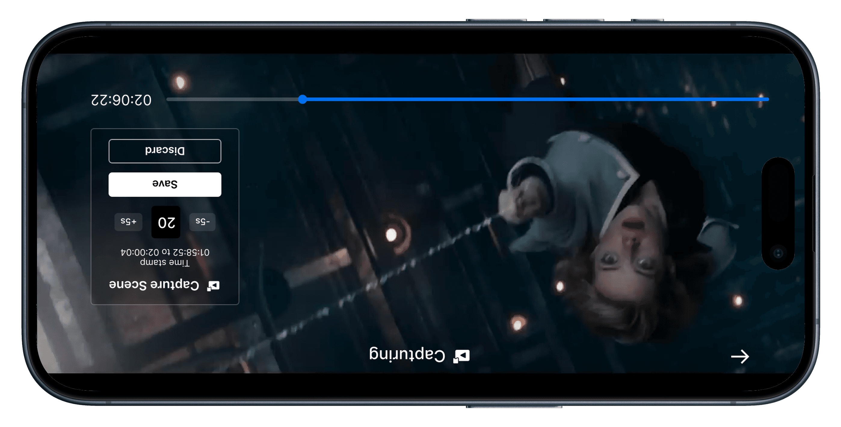
🧭 Why We Picked Variation 3
🧭 Why We Picked Variation 3
It wasn’t just the cleanest design — it was the most emotionally respectful.
Variation 3 let users capture a memory without pausing their experience. It was quick, lightweight, and stayed out of the way — exactly what capturing a feeling should feel like.
It wasn’t just the cleanest design — it was the most emotionally respectful.
Variation 3 let users capture a memory without pausing their experience. It was quick, lightweight, and stayed out of the way — exactly what capturing a feeling should feel like.
🎞️ Captured Scenes Listing — Exploring Layout Variation
🎞️ Captured Scenes Listing — Exploring Layout Variation
Before locking down the final design, I explored a few layout variations to understand how users might best engage with their saved scenes.
The goal was simple: make the experience of revisiting scenes feel visual, intuitive, and emotionally familiar — like flipping through a personal highlight reel.
Each variation plays with different levels of density, emotion, and discoverability.
Here’s a quick look at the four concepts I tested:
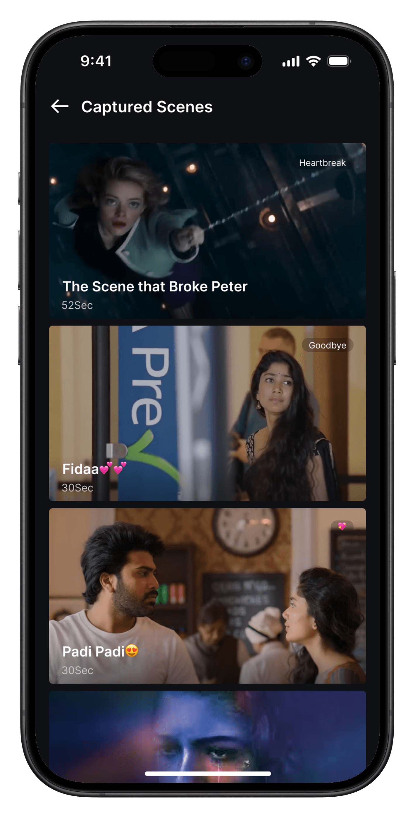
📱 Variation 1 — List View with Descriptive Context
📱 Variation 1 — List View with Descriptive Context
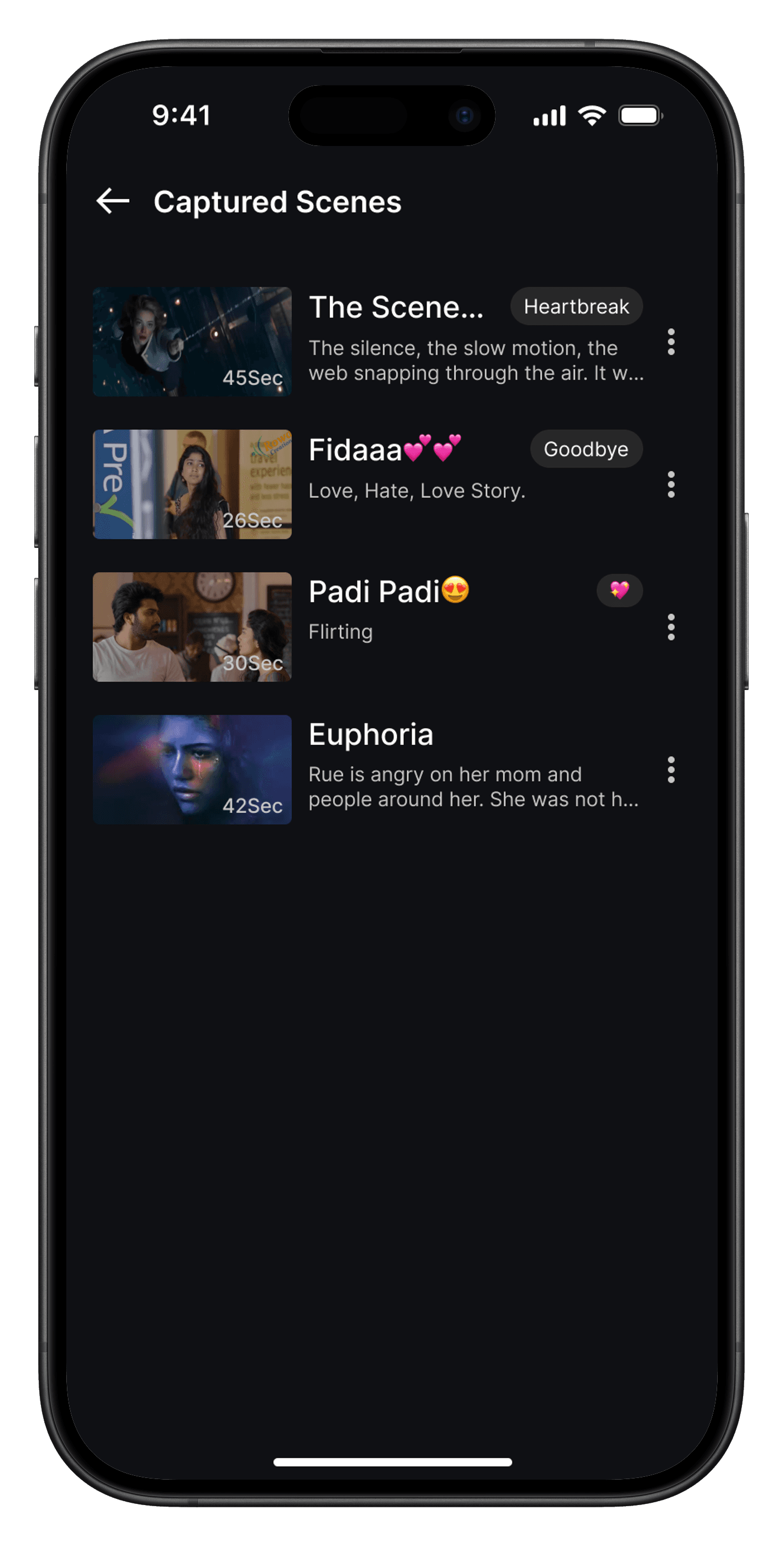
Feels like a native “Continue Watching” shelf
Includes title, duration, thumbnail, and options
Familiar and low-friction interaction
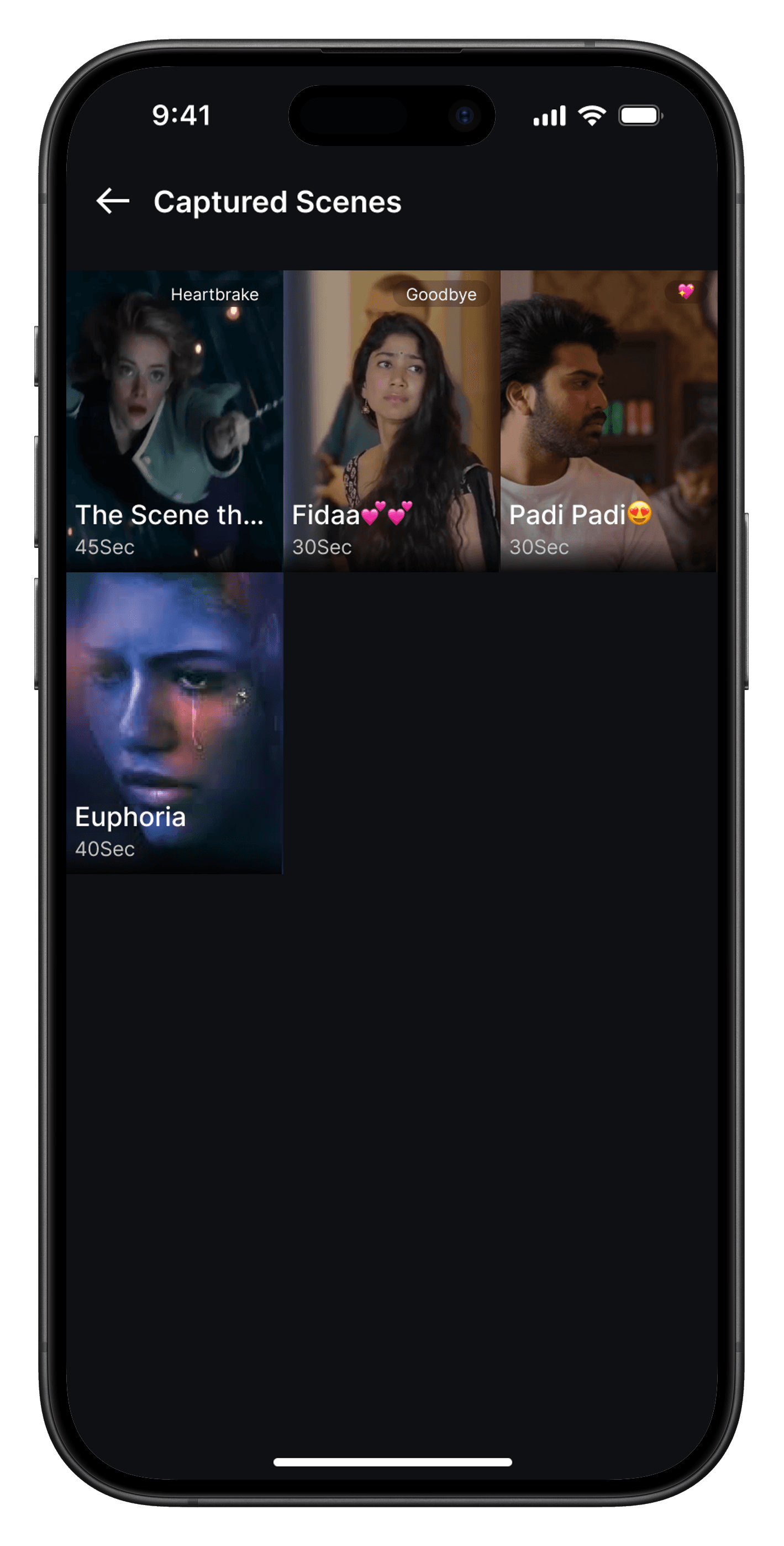
📱 Variation 2 — 3-Column Visual Grid
📱 Variation 2 — 3-Column Visual Grid
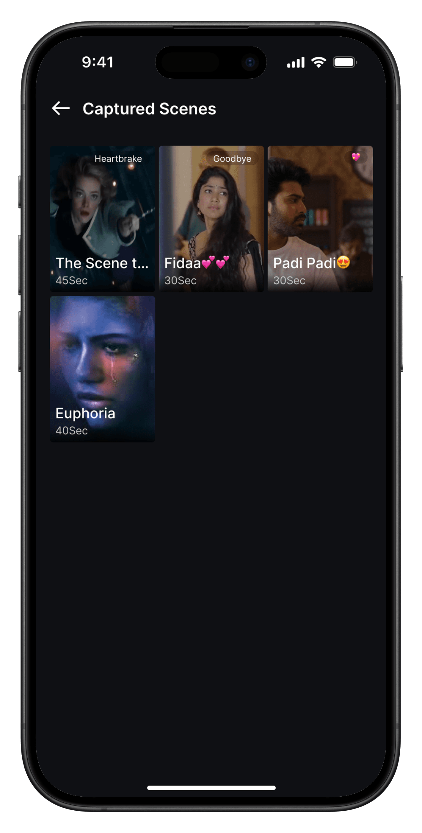
Compact grid, optimized for thumbnails
Shows scene title, tags, and time
Best for users who recall scenes visually
📱 Variation 3 — Reels-style Grid
📱 Variation 3 — Reels-style Grid
Immersive full-visual layout, no spacing
Instagram/Pinterest-style look
Ideal for fast, dense visual browsing
📱 Variation 4 — Vertical Stack
📱 Variation 4 — Vertical Stack
Large stacked thumbnails with overlaid text
Fewer scenes, more emotional depth
Encourages slower, thoughtful interaction
🧭 Design Decision
🧭 Design Decision
Among all the variations, I chose Variation 3 — because it felt familiar, instinctive, and quick.
It mirrors popular visual libraries like Instagram Saved posts, which most users already know how to navigate. The compact three-column grid without spacing made the visuals pop stronger, while still retaining necessary scene metadata like tags and duration.
This version achieves a unique balance between density and delight.
While wrapping up this layout exploration, an idea struck me:
“What if users didn’t even have to go back to the main list to play each scene? What if it was as simple as scrolling down to relive the next one?”
Inspired by Instagram Reels and YouTube Shorts, the concept here is to allow:
Full-screen scene playback in vertical format
Seamless scroll-to-play experience — swipe down to the next captured scene
Retain overlays for title, timestamp, tags, and a quick CTA like Watch Full Movie
This idea transforms the Captured Scenes screen into a looping emotional feed — giving users a frictionless, emotionally resonant way to revisit moments.
It’s not just about watching saved scenes.
It’s about feeling them all over again.
🔄 From Listing to Playback — Evolving the Experience
🔄 From Listing to Playback — Evolving the Experience
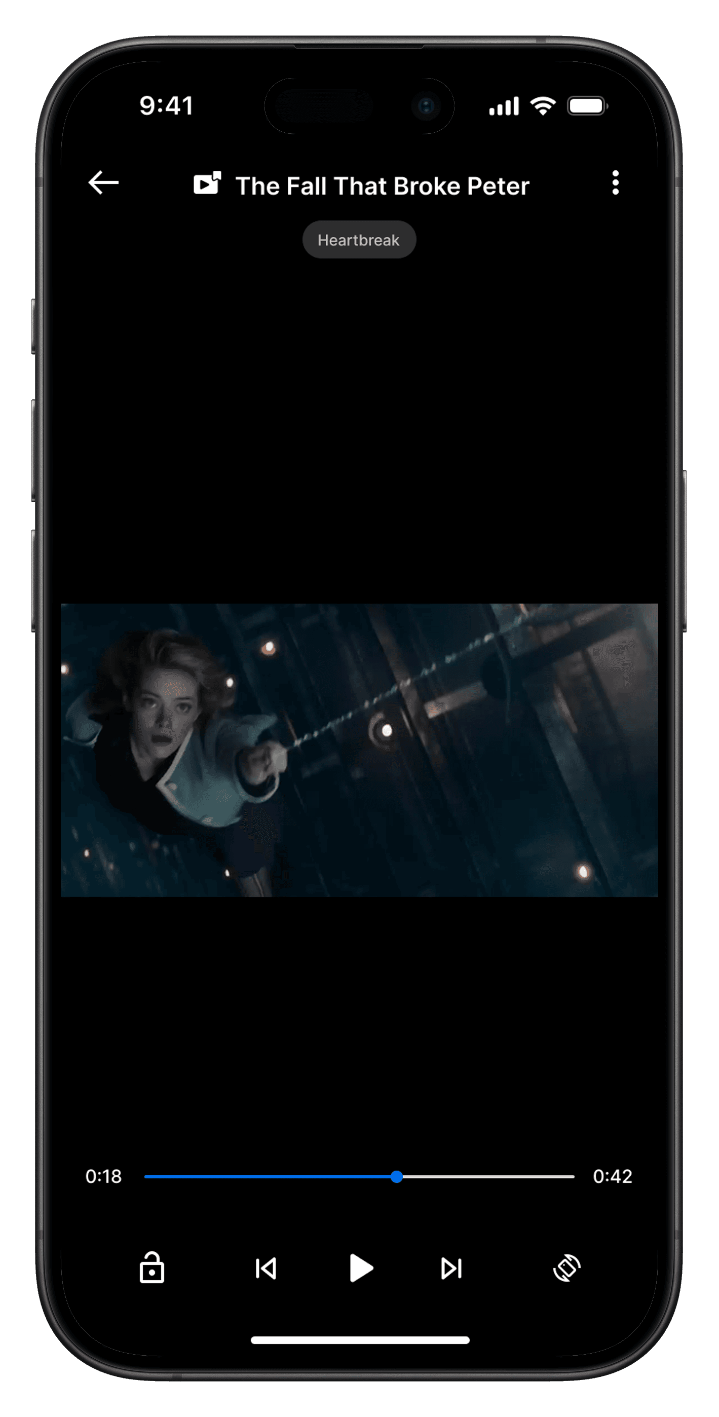
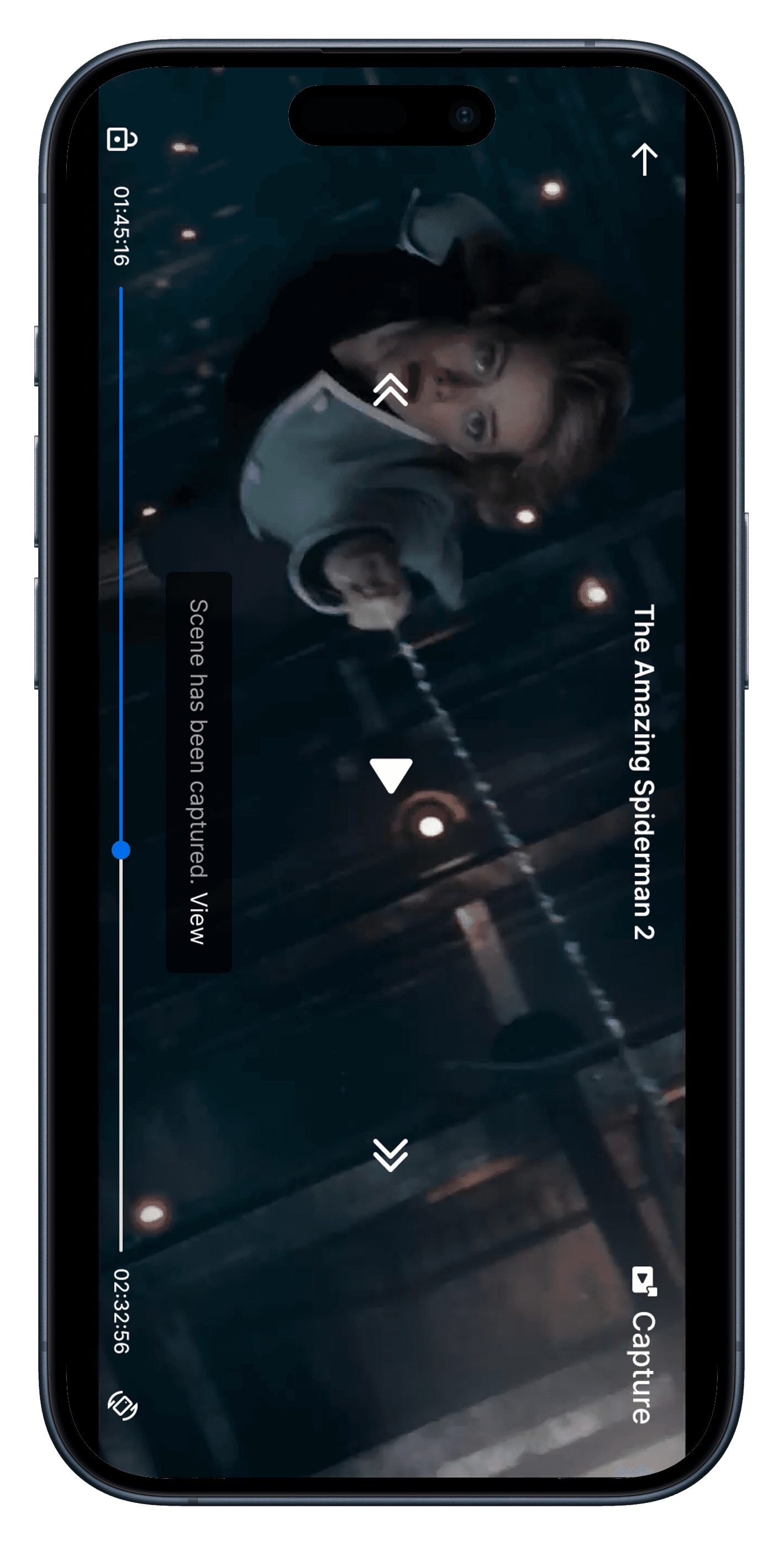
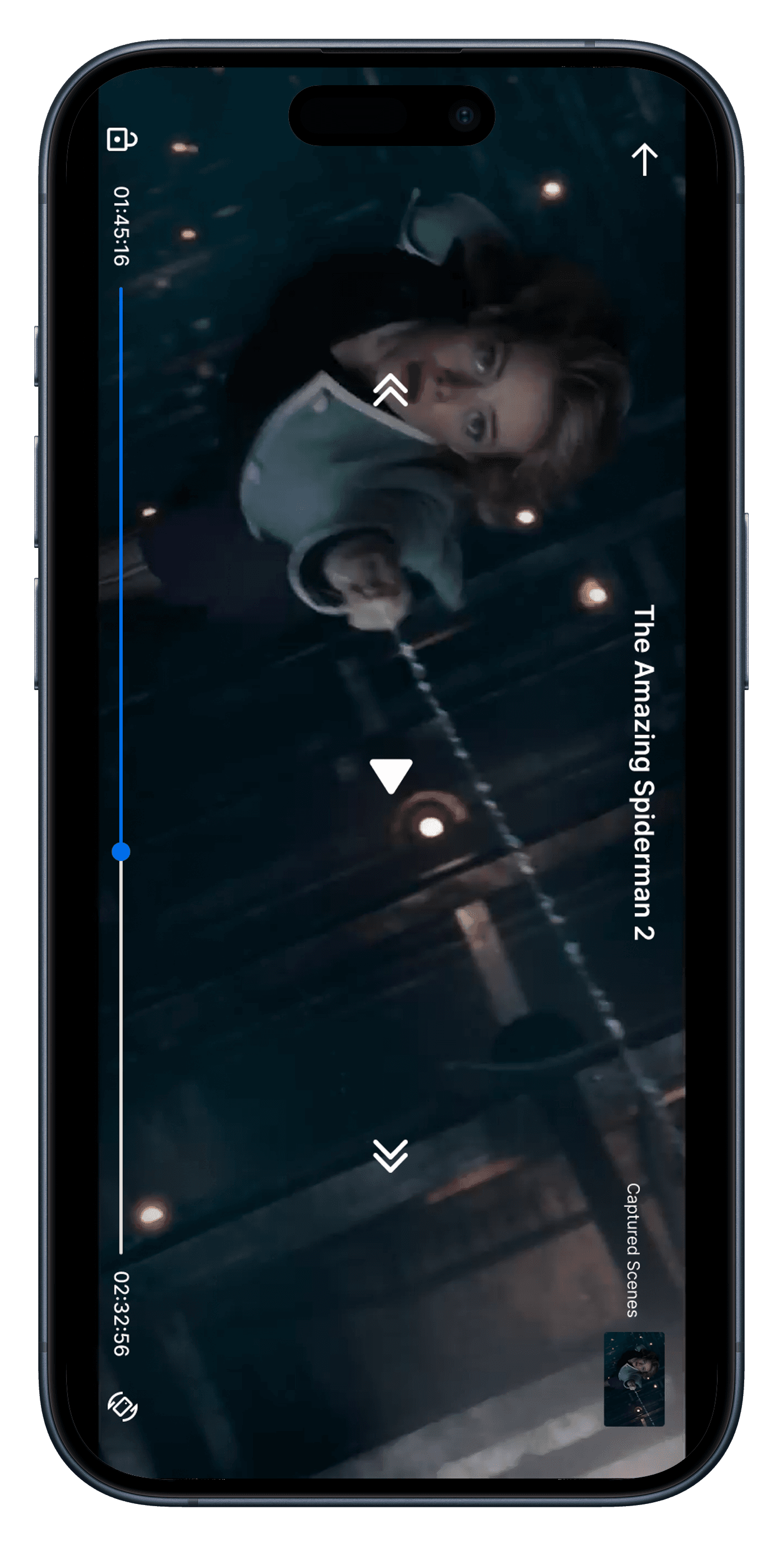
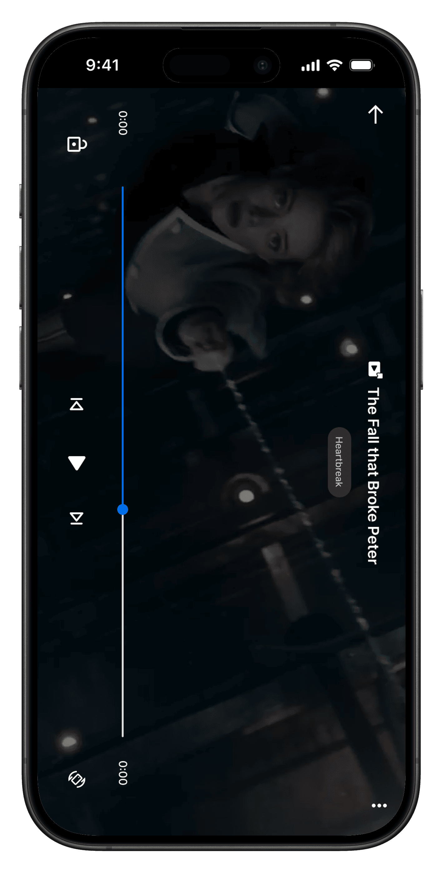
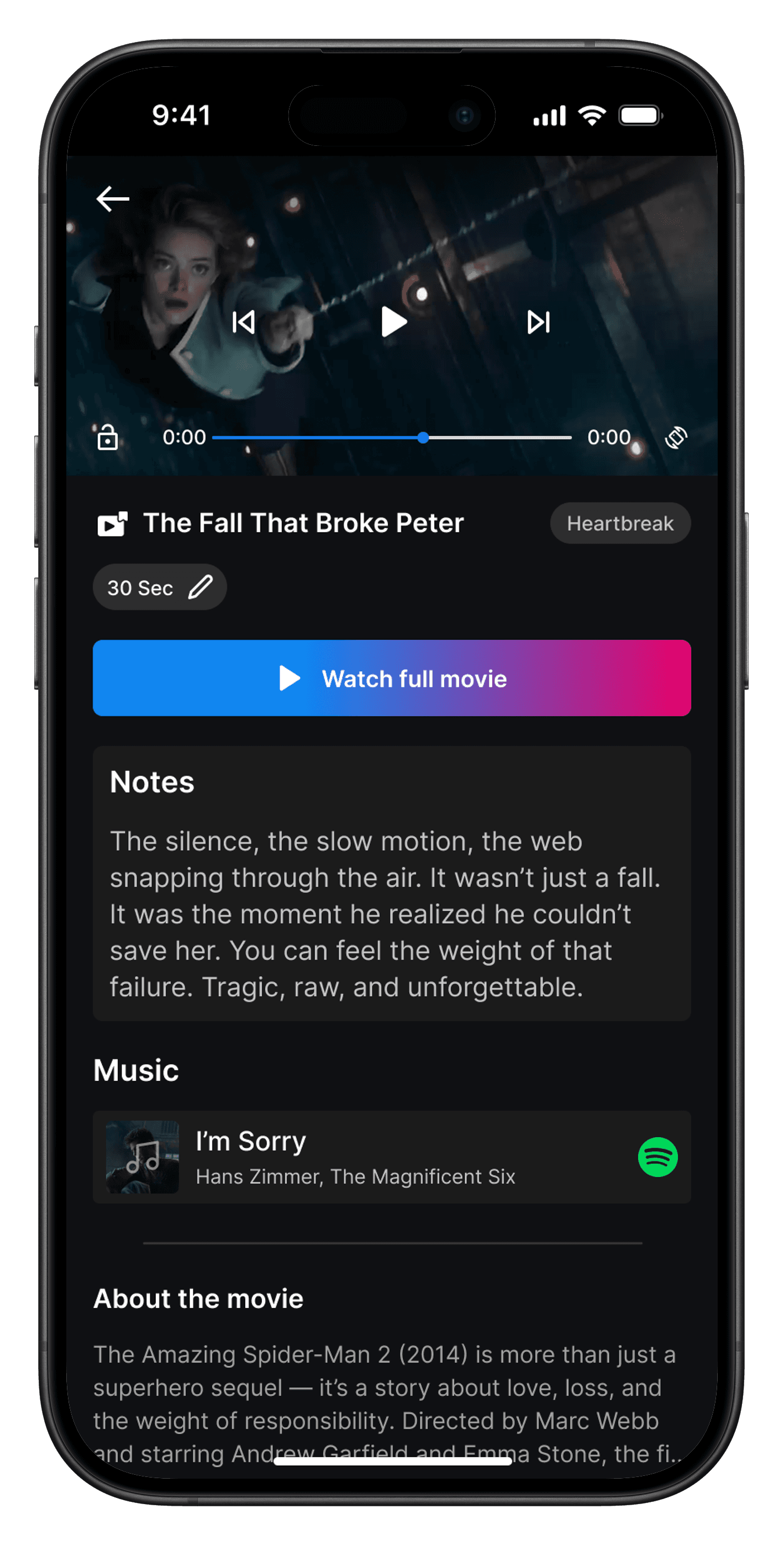
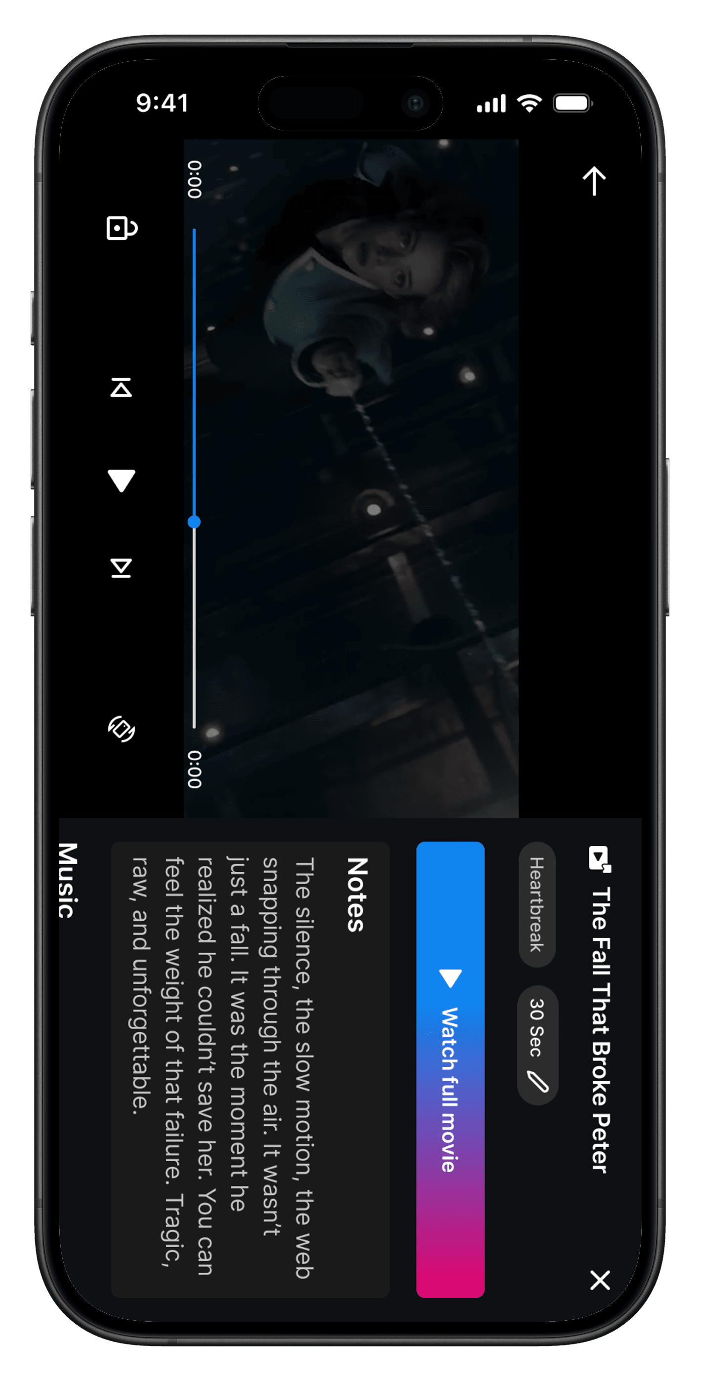
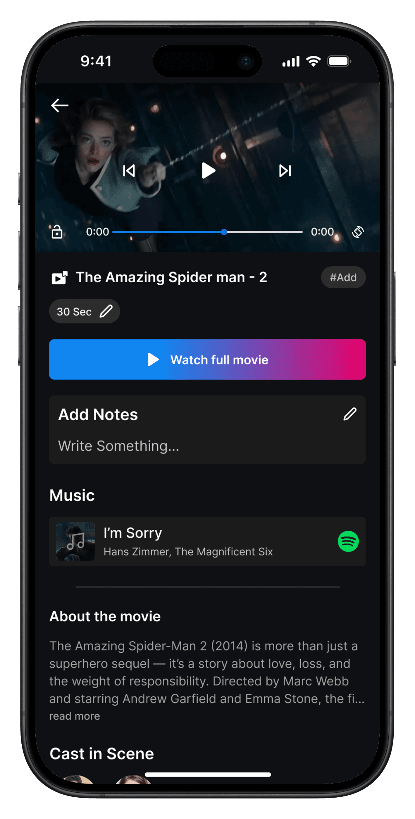
After narrowing down the layout directions, I focused on creating a single, unified screen that could deliver the entire playback experience in a way that felt intuitive and emotionally resonant. This screen plays the captured scene in full-screen vertical format, allowing users to relive their favorite moments with just a swipe. The familiar gestures — like tapping to rotate the video, swiping to jump to the next or previous scene, or accessing more details via the menu — make the interaction seamless. Users can view the scene’s title, timestamp, duration, emotional tags, personal notes, and even cast details, all within a compact overlay. Tags appear subtly on top of the video to give emotional context at a glance, while the “More” icon reveals deeper metadata or lets users jump to the full movie. Every element was designed to keep users in the moment, giving them control without distraction — so they could not just watch a scene, but feel it all over again.
After narrowing down the layout directions, I focused on creating a single, unified screen that could deliver the entire playback experience in a way that felt intuitive and emotionally resonant. This screen plays the captured scene in full-screen vertical format, allowing users to relive their favorite moments with just a swipe. The familiar gestures — like tapping to rotate the video, swiping to jump to the next or previous scene, or accessing more details via the menu — make the interaction seamless. Users can view the scene’s title, timestamp, duration, emotional tags, personal notes, and even cast details, all within a compact overlay. Tags appear subtly on top of the video to give emotional context at a glance, while the “More” icon reveals deeper metadata or lets users jump to the full movie. Every element was designed to keep users in the moment, giving them control without distraction — so they could not just watch a scene, but feel it all over again.
Hifi Screens
Hifi Screens
🔁 Future Iterations
🔁 Future Iterations
🔁 Future Iterations
While the current implementation solves the core problem and delivers a meaningful experience, there are still opportunities to push this further:
Scene Categorization & Grouping: Since captured scenes can be tagged by category, we can introduce automatic grouping — allowing users to view all "Funny", "Romantic", or "Inspiring" moments in one place.
Cross-Device Experience: Although the current focus was on mobile, future versions could adapt the layout for tablets and TVs — turning it into a lean-back experience that’s equally intuitive on larger screens.
Smart Capture Suggestions: Use AI to suggest memorable scenes automatically based on emotional intensity, dialogues, or music cues, reducing the manual effort for users.
Collaborative Vaults: Allow users to create shared scene collections with friends or family, adding a social layer to rewatching favorite moments.
In-Scene Comments & Reactions: Let users add personal notes or quick emoji reactions to a captured scene to preserve what made it special in the moment.
Conclusion
Conclusion
Conclusion
Designing Capture Scene was a journey in finding the perfect balance between speed and depth. In the early stages, our designs tried to pack too many actions into the capture moment, unintentionally overwhelming users right when they were most engaged. Through research and iterative testing, we discovered the winning formula: a fast, unobstructive capture first, followed by a dedicated space for rich personalization.
One of the most important lessons was that context is king. Placing the capture function exactly where the action happens inside the video player created far more engagement than any static or hidden placement. This insight shaped not just the feature’s interaction design, but also how we framed its value within the OTT experience.
Looking ahead, I see exciting potential in collaborative scene sharing — letting users send moments directly to friends or even create public “highlight reels.” But above all, this project proved that thoughtful, research-backed micro-interactions can completely transform how people connect with their favorite media.